Have you ever had the problem of not knowing what typeface to use? Well of course you have, everyone has. This is a guide on how to choose a font.
These pointers have been gathered from Robin Williams great book “The Non-Designers Type Book” that I recommended in the top 5 typography resources of all time.

Have a think about each of these before choosing your next font.
Choose a Category of Type
- Choose a type face that you think will match your work. ie. Oldstyle, Modern, Slab Serif, Sans Serif, Script, Decorative. Unsure of your type categories?
Quality of Printer & Paper
- Where are you getting your piece printed? If you are printing from a low resolution printer, your subtle font characteristics such as delicate serifs or fine lines will not get printed. (eg. fax machines, photo copier). Is the paper going to without the ink and quality? eg. Newspapers will absorb ink and lose finer details.
How Much Text is There to Read? What is its Purpose?
- Are you designing for a poster, a book, a report? What is more important – readability or aesthetics? What is the purpose of the text? A serious look, a casual look, a decorative look?
How Much Space do you Need to Fill? or Leave Unfilled?
- Different typefaces take up different amounts of space, even at the same point size. Try comparing two fonts next to each other and see how much difference they take up in room.
Is the Project to be Skimmed or be Really Read?
- Choose a typeface and layout that suits its purpose.
An exercise method for next time you choose a font…
- Know your output method and final reproduction process to narrow down your font choices.
- Decide on the look you want to convey.
- If you use more than one font, make sure the fonts are very different from each other. If they are not very different it looks like a mistake. eg. Use an oldstyle font for the body text and and a bold sans serif for the headline.
- Don’t be afraid to use wild fonts where they are appropriate and use it sparingly. Don’t be a wimp.
For further reading on how to choose a font check out about.com or for a more advanced ‘how to’ check out Typies, 15 tips to choose a good typeface.
How to Choose a Font Infographic
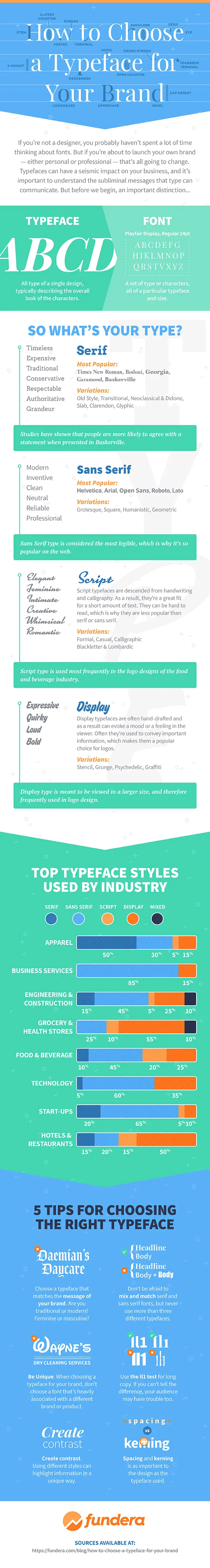
Thanks to Fundera for the infographic.
Tips on How To Choose the Right Font for Your Brand
If you are focusing on choosing the best font that helps your brand with easy identification, keeping the above stated points in mind let’s start focusing on the following points that help you pick the right typeface for your brand.
- Always start by understanding your brand’s identity because the font you are choosing will implicitly convey your company’s tone.
- Have a list of brand fonts you like. Make a note of the typeface they use. Understand what the lettering emphasizes to the reader.
- Before creating a font for your brand, do thorough typography research. It is important to learn about the structure of letters before creating a font for your business.
- Make sure your branding uses the same font throughout.
- Make sure the font that you are choosing is highly legible.
- Make sure to take into account how different fonts work together when choosing a few for your brand.
- Feel free to get feedback from people around you whenever you make a brand font because your branding is intended to target an audience.
Frequently Asked Questions
What are the four major categories of fonts?
Serif, sans-serif, handwritten, and decorative fonts are the four major categories of fonts.
What distinguishes a typeface and a font?
The difference between a font and a typeface is how they are used. A font is something that you employ, whereas a typeface is what you see. Although a typeface exists independently of a format, a font is merely a representation of the typeface.
How essential is a typeface's legibility?
The legibility of the fonts being utilized is likely the most crucial factor for functional typography that seeks to convey a message. The purpose of a typeface is to communicate a written message, and if that message cannot be read or seen, the typeface has failed.
Wrapping Up
It is critical to select the appropriate font for your tasks. Your choice of typeface should be readable, consistent with the tone of your work, and easy on the eyes. If you’re unsure, try out a few different fonts until you discover the right one.
How do you go about choosing a font or typeface?


Its often the first and most important decision… Now font choices are opening up it will be a double edged sword… good designers will use well and the many, many novices out there will turn the web into an unreadable nightmare!
Good article thank you
This is a great article – with there being so many fonts freely available to anyone and everyone on the web, I think a lot of brands/web designers lose site of this simple yet important information. A great article that I’ll be bookmarking! Thanks!
First-class article – exactly what I was looking for