Looking for timeless fonts to add to your font arsenal? We’ve outlined the best below.
There are thousands of typefaces and more are being produced daily. It is a continual challenge for designers to select the exact typeface best suited for a project.

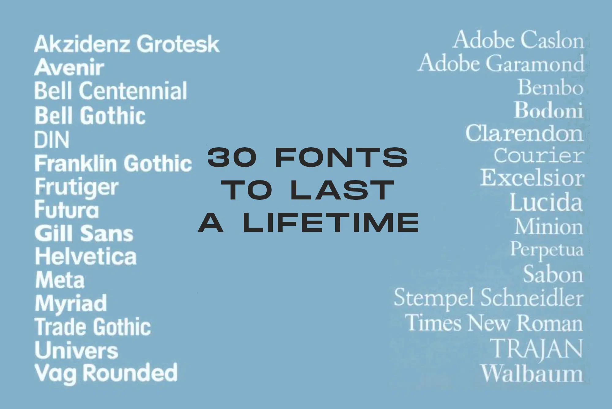
This article defines 30 of the most useful and classic typefaces for all design needs and occasions, as outlined in the book 30 Essential Typefaces for a Lifetime by Imin Pao and Joshya Berger.
There are 15 serif fonts and 15 sans-serif fonts, that will last your whole career!
A brief description of what each font is best suited for is provided however is not limited to this.
If you’re not sure how to choose a font for your projects, we have a feature that can help you. And if you need more options, our top 100 fonts of all time will give you more than enough.
15 Timeless Serif Fonts – Overview
- Adobe Caslon
- Adobe Garamond
- Bembo
- Bodoni
- Clarendon
- Courier
- Excelsior
- Lucida
- Minion
- Perpetua
- Sabon
- Schneidler
- Times New Roman
- Trajan
- Walbaum
15 Timeless Sans Serif Fonts – Overview
UNLIMITED DOWNLOADS: 50 Million+ Fonts & Design Assets

Download all the Timeless Fonts you need and many other design elements, available for a monthly subscription by subscribing to Envato Elements. The subscription costs $16.50 per month and gives you unlimited access to a massive and growing library of over 50 million items that can be downloaded as often as you need (stock effect & element packs too)!
15 Classic Timeless Serif Fonts
1. Adobe Caslon
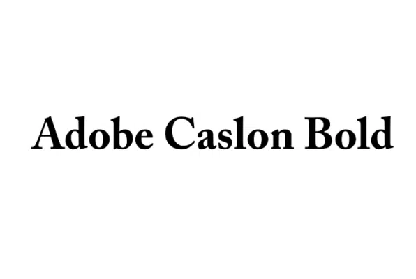
Adobe is a big hitter in all things design-related, especially when it comes to timeless fonts, and Caslon is no different.
We found the font to be a solid choice for most projects. Its clever combination of geometric and modern elements gives it a certain sophistication yet an approachable appearance.
Adobe Caslon is not only style over substance. We loved how it included almost everything an amazing typography needs: expert characters, swash letters, ligatures, alternates, and tons of glyphs.
The font’s six-weight styles, when used together, yielded remarkable results, which we truly appreciated.
The only thing we didn’t like is that it may not be the best fit for those in search of a more whimsical or playful font style.
Overall, we highly recommend Adobe Caslon to anyone looking for a versatile and high-quality font. From journals and magazines to business and corporate communication, it will handle anything that comes its way.
2. Adobe Garamond
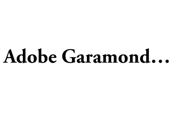
If you are a fan of contemporary-style fonts and want to add a timeless feel, then Adobe Garamond is definitely worth a look.
As professional creatives, we were thrilled with how this font managed to maintain legibility at all sizes. Its scooped serifs are easily readable for both longer and shorter text bodies. The font’s medium contrast and distinctive flag-shaped top features are certainly worth noting for their impressive aesthetics.
What we loved most about Garamond are its multiple font weights and styles that provided us with great flexibility. We used it for all sorts of designs, and each time were blown away by how effortlessly it incorporated into any template. The possibilities are truly endless with this one!
However, bear in mind that the stylistic alternates of Garamond can only be accessed through special design software. So, if you like to keep things simple, fonts like Anko may come in handy.
But overall, we would highly recommend Garamond to anyone looking to add character to their design projects.
3. Bembo
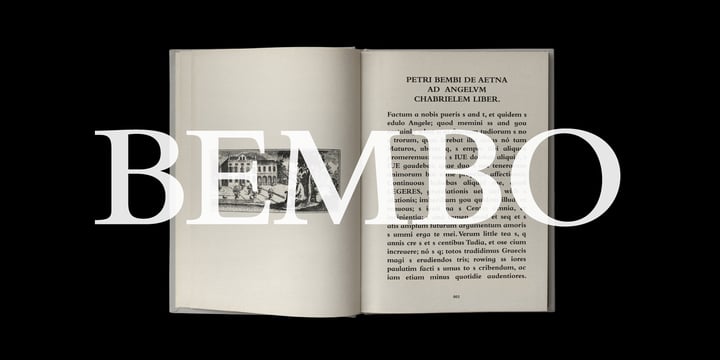
Endearing, warm, and expressive – this Monotype creation is one of the most tradition-heavy and history-rich options in our line-up.
One thing we liked about Bembo is its attention to historical accuracy. This font is inspired by the Italian Renaissance period, and its hand-carved letters are particularly modeled to replicate the era’s archival look.
Our experience using Bembo has been fantastic. The font perfectly balances out the counter elements, making it truly a delight to work with. This font strikes a unique balance—it’s both friendly and serious, technical yet approachable, and neutral while exuding warmth.
We also appreciated its old-style figures, alternate caps, and multiple weights, which worked just great on textbooks, posters, billboards, and much more. However, what we didn’t like about Bembo is that it does not include a WOFF file, which makes it unsuitable for web pages.
In conclusion, Bembo is an excellent all-purpose font that we highly recommend to anyone looking for a beautiful and historically accurate visual solution.
4. Bodoni
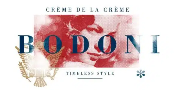
Sturdy and a little mechanical, Bodoni is the answer to all your branding and professional needs.
We used it in several projects, such as titles, headlines, and body text, and it performed exceptionally well.
The bold letters and elegant curves account for the font’s enviously timeless position. When serifs or sans serifs are not the talk of the day, Bodoni still feels cutting-edge and relevant.
One thing we particularly enjoyed about Bodoni is its versatility. Containing a listing of 261 glyphs, alternates, ligatures, and other helpful elements, Bodoni allowed us to create unique designs that truly stood out.
Just be aware that accessing these variants requires professional design software like Adobe Photoshop. The font may also seem a bit finicky to use at first. But, if you wish to move away from these restrictions, there are plenty of other options, like Baskerville, that you can try.
Overall, Bodoni is a must-have font for any professional creative looking to add a sophisticated flair to their projects.
5. Clarendon
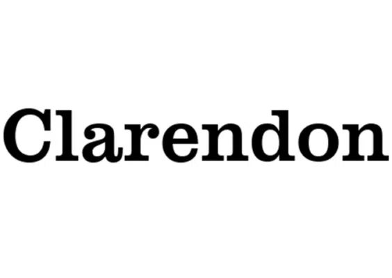
Looking for an iconic typeface that has proven its credibility throughout time? If so, look no further than Clarendon.
We instantly fell in love with Clarendon’s geometric forms and seven styles that impart flexibility and simplify designing. Its “no fun, all business” vibe is perfect for dictionaries, headlines, and any branding project where you want to convey your message loud and clear.
We were also impressed by the fact that it comes in multiple file formats, including a Web font, giving us great flexibility in terms of compatibility with different software applications.
And honestly, what’s more to ask for?
6. Courier
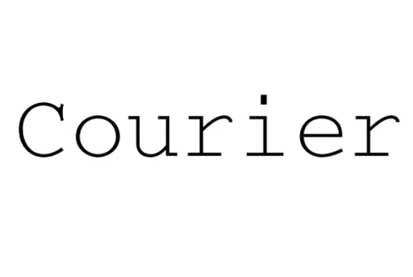
Keep things slick and smart with this timeless font by ParaType Studios.
We had the pleasure of trying Courier, and it was so much fun to work with. With letters that are just the right width, neither too slender nor too bulky, Courier turned out to be a good fit for all our projects.
We particularly loved using it on word processing, technical documentation, and tabular materials.
Our favorite part about this extensive family pack is that it is available in four styles (regular, italic, bold, and bold italic) with small caps, ligatures, alternates, and a whopping 1000+ glyphs.
However, keep in mind that the spacing between certain letters can turn out to be a bit off at times, compromising the readability. But, if you wish to steer clear of such readability issues, keep an eye on Caligor. Also, see our post on typewriter fonts.
7. Excelsior
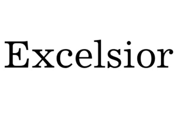
A little fun fact about Excelsior… the designer took extra care in maintaining its legibility by consulting several optometrists regarding optimal legibility.
We experienced this attention to detail first-hand. We used Excelsior in many different sizes, and never once did it turn out too “crowded” or illegible. Using the font on proposals, reports, and newsletters presented us with some truly mesmerizing results.
Another plus point about this font is its adaptability. We were impressed by how extensive the font family was. It comprises lots of alternates and includes three weights, Roman, Bold, and Italic. The Bold version really did a wonderful job of enhancing the text and making it stand out.
However, the winning feature for us was Excelsior’s extensive range of stylistic alternates and ligatures that allowed for a higher degree of customization and creativity.
Designers can experiment with them to create visually striking masterpieces.
Overall, we highly recommend Excelsior to designers looking to create high-quality, visually striking masterpieces.
So give it a try and see for yourself!
8. Lucida Casual
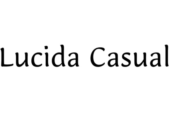
Lucida has been overshadowed by other popular fonts like Bodoni, Bembo, and Clarendon for years. But recently, it has started gaining the attention it deserves and has come to define the timeless font foundry due to its commercial success.
It impressed us with its two beautiful style variations that we mixed and matched to add more flavor.
From low-resolution printing to social media art materials, we used it in multiple ways and were glad to find that it enhanced each of their visuals.
Another thing we loved about Lucida is its distinct, easy-going vibe that sets it apart from other similar typefaces. It possesses an undefined quality that people respond to.
However, one thing we didn’t like about Lucida was that its casual vibe didn’t work well with our business-related designs, as the seriousness behind the message tended to get lost.
In short, Lucida is an excellent “no-frill” font that we suggest all businessmen and tech heads add to their creative arsenal.
9. Minion

Want to provide the entire brand experience with a unique touch? Minion has got you covered!
One thing we liked about Minion is how it was primarily created for traditional texts but yet also adapts well to the current times. It depicts the richness of the late baroque forms through the cover of modern text formats, a quality that we were most impressed with.
We were also amazed by the font’s aesthetics when we used it on packaging, logos, and headers.
But, what we didn’t like was that the clarity was only limited to smaller text bodies. This was mainly because of its too-tight kerning. Fret not, as this minor inconvenience is easy to solve using other great alternatives, such as Wolfgang by Aronetiv.
To sum it up, if you’re searching for a font that’s both classic and modern, Minion is the way to go.
10. Perpetua
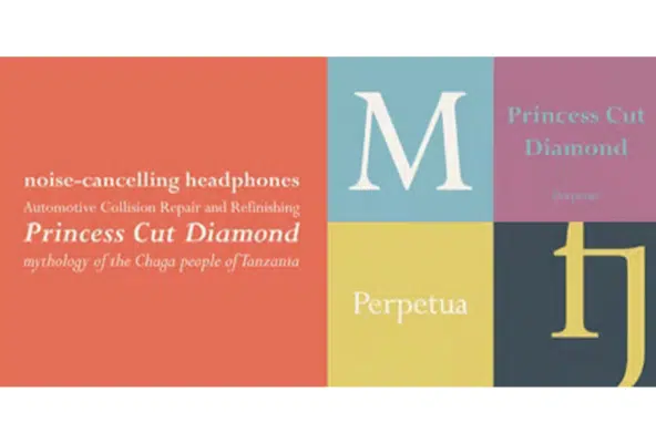
Perpetua is another gentle serif font where readability is paramount.
We liked how it featured enough space and a stunning x-height to enhance readability over long distances – it was a dream come true for our printed designs.
Perpetua makes for an exceptional addition to your roster of body fonts. We can easily imagine seeing it on pages of novels, displays with fine lettering, and chiseled texts.
What we are particularly fond of is its timeless elegance, which encapsulates the true essence of our typographic conventions. And that too without looking outdated.
We weren’t thrilled to see how its Tilting Bold version caused slight distortion of the letters and didn’t achieve the same crisp and clean appearance as other versions.
The font is available in seven styles, including symbols, font pairings, and alternatives, providing us with many different ways to add depth and dimension to our creations.
Download Perpetua right now to travel through the timeline with style.
11. Sabon
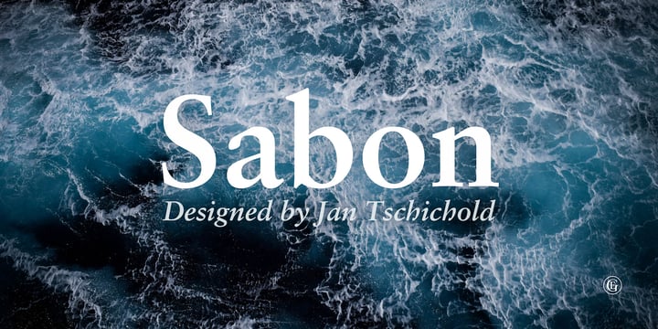
Sometimes less is more, and this typeface by Linotype is here to prove this.
As professional creatives, we loved its carefully crafted letters that helped us achieve a good reading pace and created a pleasant reading experience. Books and corporate communication are a few of the many projects where you can use Sabon.
Another thing we were impressed by is Sabon’s four weights that worked great, both as standalone and when paired together, producing outclass results either way.
However, what we liked the best about Sabon is its simple nature that does not overshadow its surroundings but can shine alongside the right composition.
The only thing that we disliked about this power pack was its lack of multilingual support, and therefore, we had to take help from other more internationally-designed fonts for our “non-English” projects.
Overall, we recommend Sabon to anyone looking for a modern, stylish font to elevate their literature and education-related projects.
It’s straightforward, versatile, and delivers top-notch results every time.
12. Schneidler
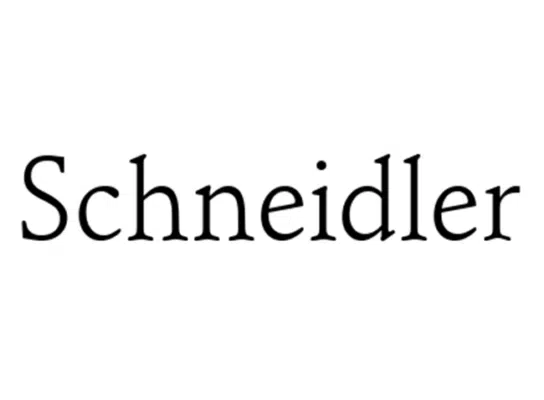
Like any business card, this font is full of smooth edges, uniform shapes, and just the right dose of attitude.
Designed by F. H. Ernst Schneidler in 1936, Schneidler has all the necessary elements to enchant the audience.
We liked how its clean, stencil letterform created an outstanding balance of strength and style and accurately represented the seriousness of our design.
We enjoyed using Schneidler on novels, resumes, and all sorts of professional and educational projects.
Another thing we were impressed by is the fact that Schneidler contains numerals, symbols, ligatures, and a complete set of characters, ensuring its functionality.
While these ornaments paved the way for easier modifications, it took us some time to get a hang of them. We vouch for Cushing Two and similar user-friendly fonts in such instances.
But overall, we would definitely recommend Schneidler to anyone looking to level up their design game.
13. Times New Roman
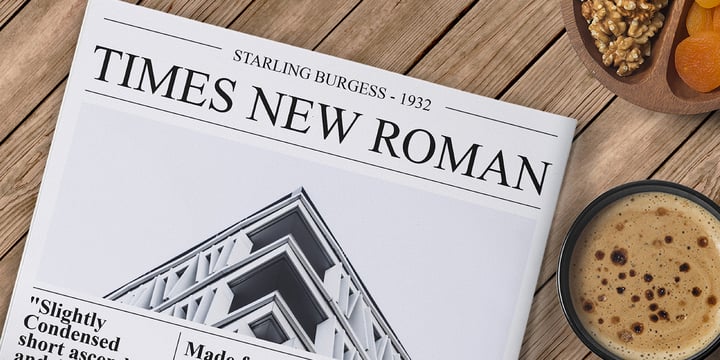
Of all the serif fonts available today, Times New Roman is the one that reigns supreme. Commissioned by the Times in 1931, this workhorse has enjoyed popularity ever since its birth. It is truly timeless!
This unique personality of Times New Roman is what truly won us over. On the one hand, its geometric characters worked great for our in-your-face designs. On the other, its humanistic roots managed to maintain readability at all sizes.
What we particularly liked about this font is that it didn’t just rely on nostalgia to catch our eye. It had twelve very attractive condensed, Roman, and bold styles to effectively get the job done – the first, in particular, looked fantastic when we incorporated it into our vintage-themed designs.
In conclusion, Times New Roman is an obvious choice for anyone seeking to create simple yet sophisticated projects.
Use it in newspapers, magazines, and corporate communication – anywhere you can shine a spotlight on its sleek lines is a good start.
14. Trajan

In search of a font whose beauty and clarity come across in various projects? This crisp typeface by Adobe is all you need!
We liked how its modern design combined with its nod to Roman art made Trajan suitable for an extensive range of our projects. Bold, tall, and brilliant, it looked great when used on posters, magazines, and books.
However, the standout feature for us was its supporting ligatures and stylistic alternates that enabled swift customization.
These variants allowed us to try our hands on different styles and make full use of this creative freedom.
Just make sure to download professional software to access these alternates.
Our advice is to add Trajan to your design toolkit to elevate your creations from something ordinary to simply outclass. Also, see our post on Fonts Similar To Trajan.
15. Walbaum
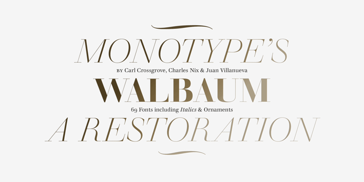
Who says the best timeless fonts always have to be serious? There’s nothing like an elegant, approachable serif to bring out the playfulness in your work.
Walbaum exudes the warmth missing from comparable typefaces like Sabon and Trajan, feeling effortlessly friendly and exciting.
We were thrilled to use its cap heights and intricate detailing, which allowed us to create a vast number of designs without compromising the aesthetics.
Another thing we liked is its availability in OpenType font format and included a range of stylistic options. From lining, proportional, and tabular figures to ligatures, fractions, and over 600 glyphs, it has every element required to start and complete a project.
What we didn’t like is the fact that this font requires certain applications to use these features.
But that’s no big deal! Try other fonts like Felis to get your hands on these ornaments without installing any tech-savvy programs.
In summary, Walabum Font is a bright and cheery font that we highly recommend based on our amazing first-hand experience.
Download all the Fonts you need and many other design elements, available for a monthly subscription by subscribing to Envato Elements. Get unlimited access to a massive and growing library of 14 Million+ items.
15 Classic Sans Serif Timeless Fonts
1. Akzidenz Grotesk
-01.png)
This sans serif typeface was first published by Berthold and released in 1896. Akzidenz Grotesk is a classic font that looks perfect in books, magazines, and websites.
We particularly liked Grotesk’s flat contours and thick structures which ensured that the message of our design got out with a boom. Another thing we appreciated about this font is that all its characters are unique and each one looks great. None of them has the same noise.
We were also impressed with how carefully its kerning and metrics are designed to suit the best reading experience a sans-serif typeface can provide.
This font brings a lot to the table: from OpenType fractions to 30 different styles, and these additional features surely helped us lend an authentic touch to our creations.
Whether you’re a designer looking to add a dash of timeless spirit to your work or a business owner wanting to elevate your brand, Akzidenz Grotesk fits the bill.
So, go forth and use it to bring the much-needed charm to your creations.
2. Avenir
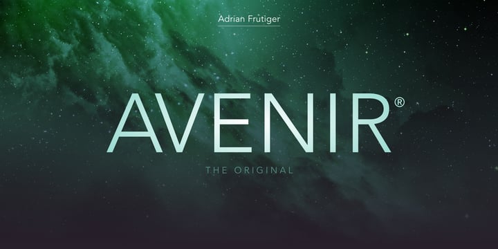
This Linotype offering is a best seller on My Fonts. And on experimenting with it, we find out all the whys behind this title.
Thanks to its sharp, geometric letters with portend aesthetics of the 21st century, Avenir helped us in delivering out-of-the-box visuals that gave our designs an edge over the competitors.
One thing we loved about it was its modest curves and gradual width changes that lend a natural, human touch to our work. We particularly loved using Avenir on newsletters, brochures, and souvenirs.
Another impressive feature of Avenir is its multiple file formats, ample kerning, and various styles that further improved the font’s functionality and provided us with lots of flexibility regarding the design aspect.
However, on the flip side, Avenir didn’t work as gracefully for shorter body texts. Hence, you will have to look for other fonts for such needs. A quick piece of advice: try starting with the super flexible Hans Kendrick SE!
In summary, Avenir is a definite pick for any creative endeavor. Its modern look and bold design are sure to impress! Also see our post on Fonts Similar To Avenir.
3. Bell Centennial
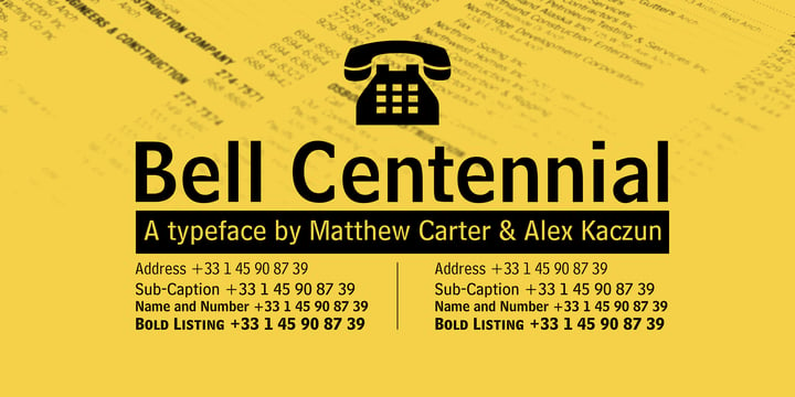
Bell Centennial is a one-of-a-kind font that was created to solve contextual problems. Small, pristine, and functional, this typeface has myriad uses.
We enjoyed using it for newspaper designs, novel pages, and even business branding.
We particularly liked its distinct nomenclature that is specific to the phone directory hierarchy. These names guided us through the process by simply suggesting the best-fitted style for the purpose.
Another thing that blew us away was the font’s PUA-encoded numerals punctuation and multilingual characters which increased its versatility and made it a suitable option for local and global designs.
Overall, Bell Centennial is an excellent investment for those wanting to lend a delightful touch to their formal designs.
Pure indulgence – that is what we are talking about here!
4. Bell Gothic
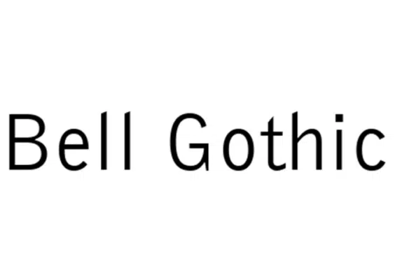
Bell Gothic is another typeface that pays homage to phone books and directories. This precursor of Bell Centennial was specifically designed for AT&T in 1938. Bell Gothic served as America’s standard directory typeface for forty years. Proves its credibility, right?
We were impressed by the font’s space-saving design, featuring uniform and moderate-weight lines. It was a delight to use it for listings, catalogs, and other smaller text chunks.
On experimenting with Bell Gothic, we found it straightforward to install and use on PC and MAC devices. Moreover, its variants are accessible through multiple basic software.
What we didn’t like is its lack of PUA-encoding and multilingual support, which can limit its fluidity to an extent.
All factors considered, we are convinced that Bell Gothic is a fantastic typeface. Whatever you use this dedicated font for, it will always understand the assignment and meet your expectations.
5. DIN 1451
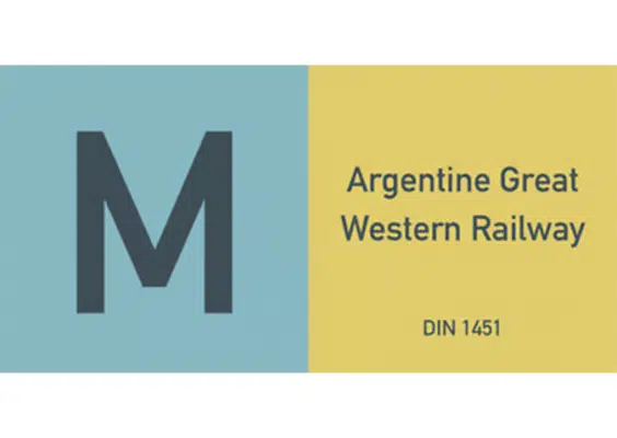
The star stellar quality of all sans serif fonts is their ease of reading, writing, and understanding. Keeping up with this standard, Din 1451 was released by Linotype for a variety of purposes.
Initially, this typeface was strictly used by Germans for traffic signs, administration, and technology businesses. However, given its popularity and legibility, it gradually paved its way into the world of marketing and branding.
Our favorite part about Din 1451 is that it contained three different styles and supported numerous languages. While the font looked extremely graceful and formal on official documents, we were not particularly a fan of its somber look.
If you are looking for a font to bring life to your design and make it seem more approachable, we suggest skipping on Din 1451 and instead picking something similar to the Sol De Jalisco typeface.
6. Franklin Gothic
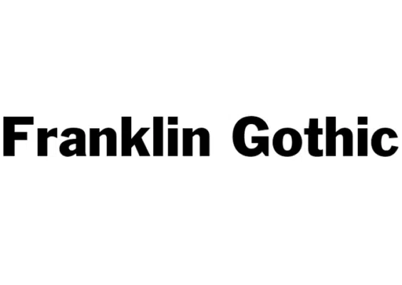
Are you in dire need of a font that easily fits into compact spaces without looking odd or out of place? If yes, then the Franklin gothic sans serif script is exactly what you need!
As creative experts, we found its thin characters with smooth, round strokes and a robust outlook ideal for various project styles.
However, the best part for us about the Franklin Gothic lay in its subtle stroke contrasts and monotone design. Both of these qualities made this typeface a suitable choice for use in newspaper articles, advertisements, and posters.
After experimenting with the font ourselves, we were impressed by its other commendable features including its multi-lingual support and alternate characters for added versatility with various design templates.
All things considered, we are completely in love with the modern look of Franklin Gothic and consider it to be the most widely picked in the bunch.
7. Frutiger
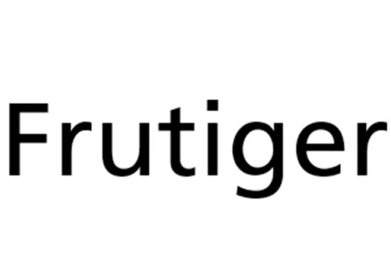
Let’s be real, every designer wants their sign board to stand out in a crowded room and grasp the attention of the reader right away. This becomes even more important when the board contains important directional instructions for the audience.
We loved how Frutiger countered this specific issue and guaranteed maximum visibility of all projects we used it on.
The Frutiger family consists of various weights, character sets, and support accents.
However, what stood out the most to us was its unique font style. The characters were not strictly geometric or calligraphic but instead had a prominent, readable, and easily recognizable feel.
In our experience, while Fruitger is an exceptional choice for display and sign boards, its soft and warm texture goes well with the secondary body text of magazines and pamphlets as well.
Considering its versatility, Frutiger is undoubtedly one of the most flexible fonts that we have found until now.
8. Futura
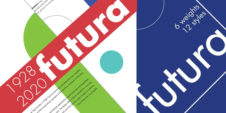
Next up, we have an evergreen timeless font that fits perfectly with the art styles of all generations. Futura started off as rough sketches of various shapes and with time, evolved as a sleek, geometric, functioning typeface.
Taking after its name, Futura contains futuristic and modern letters in up to 22 different styles and weights.
Not only this, but we also particularly liked how the font offered Latin, Greek, and various other language characters along with their alternates and font pairings. The thing we admired most was the generous line spacing between the characters, providing a neat, crisp finish.
However, we didn’t like the fact that Futura sometimes looks too formal on casual posters and instead recommend you consider the Bennet display instead.
Overall, we highly recommend going with Futura if you are working on a professional project that is in dire need of refinement. Also, see our post on Fonts Similar To Futura.
9. Gill Sans
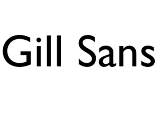
Gill Sans is the trademark typeface of the brand Monotype and is heavily inspired by the signage of the London
Underground Railway. This timeless sans serif font has a vast family of multiple styles, languages, and character sets.
If you are an admirer of British culture, like us, then you are bound to be enchanted by the character design of Gill Sans.
We particularly liked its historic style of lettering with hints of geometry for a modern yet playful feel. Moreover, it also featured Gill’s famous signature flared, eyeglass lettering!
Our experience with Gill Sans was flawless for use on signages, display boards, and secondary text. Lastly, we were impressed by its compatibility with PC, and Mac and as a hybrid CD for both platforms, making it a suitable candidate for all types of designers and digital artists.
10. Helvetica
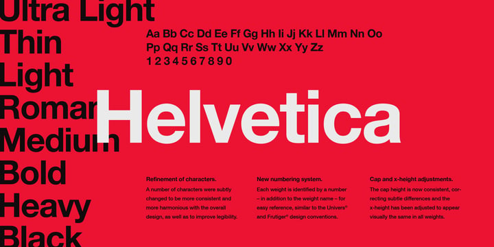
Following Monotype’s legacy, let’s take a look at another one of their reputable timeless sans serif fonts. Helvetica means Swiss in Latin and has been linked with the Swiss presswork from the 1950s until the 1960s.
This family pack consists of 30 different font styles and impressive OpenType features. What we admired the most about Helvetica is that it presented information without beating around the bush with extravagant characteristics.
We found Helvetica to be an adequate fit for books, magazines, and newspapers, all thanks to its polished, neutral, and modern letters. These get your point across to the reader right away.
At the same time, we understand that Helvetica might be too formal and stoic for certain occasions. In such cases, our team of experts recommends going for a more fashionable typeface, similar to the New Ayres font style.
All in all, it truly is a great font to consider for your creative projects. Also, see our post on Fonts Similar To Helvetica.
11. Meta
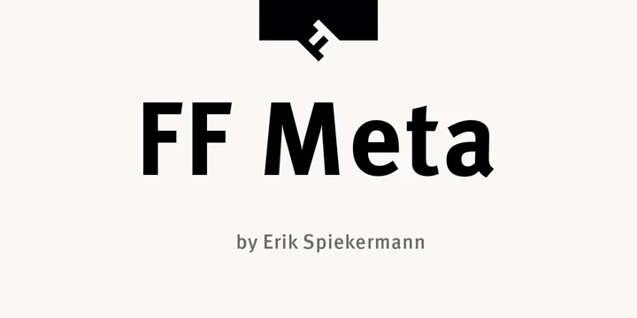
We were thrilled to get our hands on Meta and suffice to say, it didn’t disappoint us in any way. Meta is a carefully designed futuristic font that seems to catch the eye of every onlooker with its charm.
Its letters with smooth, round edges and open terminals added a contemporary and welcoming feel to our masterpieces.
After using the font with various design templates, we can confidently deem Meta perfect for advertisements, websites, and branding.
Moreover, its geometric structures, 130+ glyphs, and multilingual support improved the quality of our formal documents and magazine layouts by a huge degree.
However, one thing that we didn’t like about this typeface is the lack of styles it offered in its family pack. This wasn’t a big problem for us but those who like playing around with different font styles might want to skip Meta for the time being.
12. Myriad
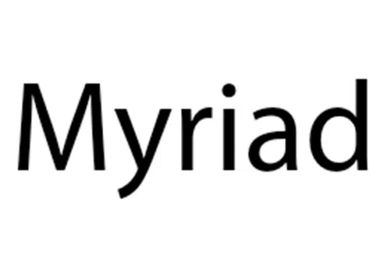
If you are looking for a font that looks equally attractive as both the display and body text on a project, then look no further than Myriad!
Myriad is a sans serif Adobe font that contains additional glyphs supporting Greek, Cyrillic, and other Latin-based languages.
For us, it proved to be the perfect blend of humanistic and modern typography. It featured sharp, clean shapes, precise characters, and kerning pairs that provided added flexibility, creativity, and control over the design.
Another aspect of Myriad that came in handy was its included set of extended widths in a wide range of weights.
Suffice it to say, Myriad lived up to our expectations by providing an easily readable and usable font for a variety of our projects including all-purpose media and large displays.
We highly recommend giving it a try! Also, see our post on Fonts Similar To Myriad.
13. Trade Gothic
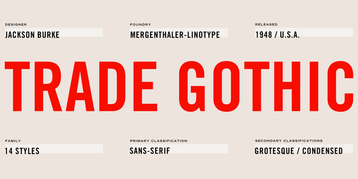
When you think about timeless fonts, you think of a monotone, simple design that focuses on the information more than the aesthetics.
Trade Gothic by Linotype offered us the best of both worlds with its sleek, neat lettering with an earthy feel. We were big fans of its wide collection of languages including Romanian and French.
Although the font paired well with most design templates, we specifically liked how it looked as newspaper headlines, advertisements, and media posters.
The only drawback that we found while using Trade Gothic was its lack of multilingual support that is otherwise found in other popular sans serifs. If a multiple language supper is significant for your artwork, you can try opting for the Secretary typewriter typeface instead.
In conclusion, Trade Gothic is a fantastic font for all global designs that you wish to make stand out.
14. Univers

Univers started off as a dream to fulfill all typographic needs and soon evolved from rough sketches into the advanced, attractive form it is now.
It is a collection of steady, clean letters that drip off richness and proficiency. However, what helped us shortlist this font in our list is its diverse weight and style collection.
Be it for old-style, modern, slab, or casual use, Univers had just the right weight we needed to transform our project into a masterpiece right away!
We particularly loved its adaptable nature and tons of weights and alternates.
Univers is definitely one of our top picks for designing creative typographic projects along with writing longer, secondary text. Unleash your true potential with Univers’ limitless features and multiple accents! Also, see our post on Fonts Similar to Univers.
15. Vag Rounded
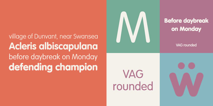
Last but not least, we have a lively yet professional timeless typeface to improve the overall visual appeal of your designs.
Just like its name, Vag Rounded is an all-rounder sans serif script family that consists of four different weights ranging between thin, bold, and black.
The typeface featured geometrically aligned, smooth edges and curved terminals that gave a welcoming and warm energy to our designs and proved to be ideal for logos and typographic projects.
We also tried pairing Vag Rounded with other reserved sans and sans serif typefaces and found the results to be extraordinary! It maintained a cordial balance between a friendly and formal outlook and hence, didn’t turn out too showy.
It also had OpenType features and multilingual character sets that further allowed us to make the most out of it.
We weren’t thrilled to see how some of its weights didn’t turn out to be as clean and clear as the regular version.
But overall, we highly recommend Vag Rounder to anyone looking to create eye-catching and attention-grabbing professional designs.
Classic Timeless Fonts Summary
And with that, it is time to wrap up this Timeless font list. Regardless of where you are in your design career, you now have access to a few great font choices. And no matter what kind of branding and design you do, you can rest assured knowing that these classic fonts will never go out of style and always be there to save the day.
They also come in different formats, thus becoming compatible with different digital art programs. This only further cements their timelessness even in the digital age.
Do you agree with our Timeless font list? Let us know your thoughts in the comments below!


Thanks Sumesh, I have added new links. The adsense ads are only there to cover my hosting costs but maybe that is why I have not been as successful on Digg as other social media sites.
Vivien, well I ‘spose slow and steady didn’t win the race this time 😛
Nice list. I’m not a big fan of the serif fonts, but the sans-serif are top notch 😀
Nice list, and dugg. But I’m disappointed that you don’t have links to the fonts.
I’m not the typical Digg crowd, but those that are digg crowd-ish, will bury you for that Google AdSense unit. I have experience that suggests that you should remove them or else be buried (you won’t get much clicks from diggers, SU is better).
Sumesh’s last blog post..How to access FTP servers without any software
hehe… I’ve started writing a post on these 30 fonts last year, but somehow left it in my Drafts and never got back to it. I do like your approach and brief notes on when each of these types works the best.
inspirationbit’s last blog post..A Bit Of Literature – Never
I take it you limit yourself to only one specific type of design then? 😉
Nowhere near enough diversity in this font list, although I will admit there are some absolute necessities in there.
Ric.
This post sucks. Why?
1) its called “30 Fonts That ALL Designers Must Own” but you could not find a preview for Bodoni (don’t you OWN the fonts?).
2) Showing the name of the font in preview? Seriosly, how does the rest of the font look like? next time try with “The Quick Brown Fox…”
3) Vag Rounded on instruction manuals?
Burried
I have been looking for a font with an over sized period (.) Anyone know where to find one?
Well, I agree with many of the selections I disagree with a few as well. I know they’re culled from a book, so please don’t think I’m criticizing you, but the original authors.
Courier? Seriously? I could go my entire life without using a monospaced font. If we want technical, typewriter-styled fonts there are quite a few others out there that are not kerned so horribly.
I personally don’t see the need for Bell Centennial ever, since there are many quite good fonts out there that will suit its purpose.
Meta…and don’t get me wrong I friggin LOVE meta, is quite trend laden, and isn’t a lifetime type of font like Garamon or Sabon. Meta’s was back ‘in’ last year, so expect it to be ‘out’ for 2008.
And I’d completely disagree with them regarding Times. Nobody ‘needs’ Times New Roman, but it’s ubiquity simply means we’ll never get rid of it. For you aspiring typographers out there, anything where Times will suit, try Minion or Garamond instead.
I’m surprised that there isn’t a single ‘web friendly’ font like Georgia or Verdana in the list. These fonts are important because they are designed better for on-screen reading compared to others (turn of anti-alising on your system and look at these fonts…they’re still legible at nearly every size, now look at Garamond without it…yuck.) which is critical today, and will definitely be needed for a lifetime.
Really nice article. Don’t worry about the adsense words. That won’t prevent you from getting popular on Digg…it’s mostly hit or miss. Adsense ads are the least obtrusive. For everything else, most digg users us adblock.
Nice work and congrats on making it to the front page.
Nice list. 3 favorite or missing fonts would be; Clearview, Garamond 3 which is a better cut that Adobe Garamond, and the incomparable Scala Sans.
no script font?
ha… most of them look the same. i not agreee with the list.
I would have liked to see information on the licenses covering usages of such fonts. None seem to be free.
nice fonts selected! A personal one I would add is FF Meta Serif. A new font, however fantastically designed.
It seems like most of the serifs were found in an Adobe font list. I like the list of sans much better, they can be much more useful/fun.
Best fonts? Why? By who’s metric? What justifies these as the “BESTâ€? Simply your say so?
WHAT?!?! Papyrus isn’t #1???
What a crock…
😉
For Serif faces, I think ITC New Baskerville is one of the best transitional/modern serifs and needs to be part of every designer’s repetoire, and for slabs/Egyptians Rockwell deserves the spot more than the mono-spaced typewriter font Courier. It’s hard to quibble over the sans list. Maybe Thesis Sans deserves a look, and Gotham is a nice face, but with any list you can always find others to include.
cool, I always wondered the difference between sans-serif and serif I just never cared enough to actually look it up.
thanks to your convenient wiki links, I learned today so thank you.
Another tough day for your server huh Jacob?
🙂
Regan’s last blog post..5 easy website improvements for small business owners
I believe that the Gill Sans family has over-sized periods. Gill Sans Extra Bold for sure. My favorite font, hands down.
Thank you all for your comments!
Digital Revolutions, What your preferred serif fonts?
Keetano, What would your list include?
Mike, Your welcome and judging by my stats, a lot of other people were in your position too.
Ric, Thanks for your comments, the fonts are there to last a lifetime!
Zachary, thanks for the movie link, twas great!
Eugene, If we all had the money we would own the fonts or at least some of them.
Vinay, I do not codone piracy.
Jeff, Comic Sans 🙂 Mmmm.
Bigalow, oversized period eh?
Adrian, interstate, nice choice… I don’t agree that this is a MUST own list but it sure is a good start and attention getter.
Andrew, I got the list from a book.
Miro, Depends on the quality of the client.
Wisefool9, thanks for your long comment. I acan see where you are coming from on some of the things you brought up. Thanks!
Ryo, Thanks… yeah I use adblock too, never see Google ads anyway. But it does cover server costs.
Jamie, I agree with you there especially as a student. Maybe I should have changed the title.
Ben Whitehouse, Thanks for your font suggestions.
Ed, Nope no scripts here.
John, Licenses are found on the linked pages.
Daniel, Thanks for your contribution,
Jive, Well every font is unique!
Joe, Each to their own.
Yonah, SEO that is all.
Ryan, Thanks for your contribution… not so sure about Rockwell. Gotham is nice though 🙂
Regan, Tell me about it! 40,000 visitors in 10 hours! Solid Internet (my hosts) got it sorted out pretty quick though.
Rick, Why is it your favourite font?
Liza, I would have to ask the authors who compiled the list why it was not included. Must have been hard to narrow it down to just 30 out of the thousands of fonts available today.
Thanks again everyone for the comments and to the other 350+ who commented on Digg.
Jacob, I was a little surprised that your commenters did not pick up one error: your Lucida sample is not set in Lucida, but in Excelsior. Not that I mind: I am not a huge fan of some of the Lucida subfamilies.
On your choices themselves, this collection is not a bad mixture. These families are good workhorses.
Favourites for me would be Jean-François Porchez’s Sabon Next (published by Linotype), Plantin and Century Old Style. For egyptians, Century Expanded remains one of my favourites.
Sans serifs: we have an internal Swiss typeface which we tend to use instead of Helvetica, but since it’s not publicly available we can’t realistically count it.
I’m going to have to disagree concerning Trajan. It’s used too much.
Hey Jacob – cool list. I don’t do a lot of design, but I dabble here and there. Not big on a few of the fonts, but will try using most of the others a bit more. Thanks!
Chad | ProFreelancing’s last blog post..Building Credibility as a Freelancer
I wish you included a link to download them! No wonder people come form Digg for it getting disappoint only seeing a review!
Good Luck 😉
Vinay’s last blog post..Facebook Anthem – I’m Getting Bored of Facebook
Aquà podréis hallar otra recopilación http://del.icio.us/yadgana/fonts
Bye
I personally LOVE Comic Sans. Very versatile.
Great selection of fonts. And is interesting how you specify the way that these can and are used. A font that i really like that was not included in the sans-serif font is Interstate, a very clean and readable typeface that can be used in a number of ways. I am not sure if it a font a designer MUST own, but it is in my list of top sans serif font.
Adrian’s last blog post..Inter Abroad
These choices seem almost too obvious to me… but it’s a good list nonetheless.
Great lineup of fonts, I have a standard attitude towards fonts that cost hundreds of dollars, there are so many nice ones available for free, so I would never pay for a font, got to keep the cost down for the client.
miro’s last blog post..The “Huge†Security Guide
Good selection of fonts..
Nice list but some of these are incredibly expensive, $695.00 for the Akzidenz-Grotesk BE Collection? Not all designers can afford all of these so I don’t particularly agree with the ‘must own’ part but I must admit I sure want them!
I agree Digital Revolutions. These sans serif fonts are great however I feel that there are some great Serif Fonts that are missing out, in particular Adobe Jensen / Janson
It would be nice if the Serif fonts listed if they have small caps for numbers. (Georgia has small caps for numbers).
jive’s last blog post..Royalty Free Sounds
What about Goudy Old Style??? If Caslon and Bembo are on here, Goudy Old Style’s gotta be.. it’s a classic!
cool, sans serif is my most favourite font, it’s much better than times new roman or arial!! haha.
i’ve learnt a lot, it’s got me to my special place once more
thanks!
Awesome List!
Thank you very much for these. You got my bookmark!
These fonts will be very handy for our web developers.
We use Myriad a lot, and this will give us a good page to see more options.
The title of this page (in my browser) is “30 Best Fonts, Downloadable Fonts, Free Fonts, Cool Fonts for Designers,†yet as far as I can tell, all the links go to ITC, who charge for their fonts.
Also, I don’t like most of those fonts. The only ones on that list that I like are Courier, Times, Trajan, and Helvetica. I could not disagree more with Wisefool9, who said that there is no need for Times; if I were the client, I would certainly not let the designer use Minion or Garamond in place of Times. ITC Garamond might be OK because its x-height is more than half its cap-height; regular Garamond is too distorted for me.
Fonts that should be included? Let me check my font folder…A.C.M.E. Explosive is the only decent free comic book font; for money, Whizbang or Comicraft’s Gibbons. Everyone should have a good Souvenir, a good Benguiat, and a good Cooper Black for their retro needs. At least one decent calligraphy font is necessary; the best is RSLaserLondon, an outline version of the old London from the 1980s Macintosh “city fonts.†For simulating computer text, real, actual computer fonts are necessary, like OCR A Extended, November, PC Senior, and one of the many old-style video game fonts like Joystick/Emulator/Arcade. For typewriter fonts, VTCorona and American Typewriter. And here’s one that just recently came up in a project: ModeSeven. A friend of mine needed a font to make a video he was editing look like someone was changing channels on a TV, and he turned to me for advice. I used to have the right font, but after racking my brains I couldn’t think of its name, so I asked the LiveJournal community “fontaddicts,†and someone gave me the name. See the result here: http://www.youtube.com/watch?v=wvn6kvVLbjc
(Edited to turn notification of followup comments on and replace HTML directed quotes with copied-and-pasted directed quotes. If post appears twice, please delete first version.)
Jack Yuan, good pointing out, I will have to fix that up. Please note I did not make the choices it was the authors of the book from where I got the source.
Chad, your welcome.
Christian, Thanks for the link up 🙂
Josh, Thanks.
Rachael, Everyone is entitled to their own opinion 🙂
Luke, just for clarification ‘sans-serif’ is not a font, it is a decription of how to classify a typeface.
Sesebian, Your welcome
Lukas, Your welcome, may your web developers have success.
Katibob, it seems by looking at who has clicked which fonts the serif fonts were more popular.
Felicity, yes the title is that, more for SEO purposes however some of the fonts are free but make sure you check on the licensing. Everyone is entitled to their own opinion. Thanks for your contribution with the other font styles, conv, some great ones in there. I think you chose the right font for the tv channel. You sound like a font addict yourself 😛 Hope you stick around, I value your contribution!
Thanks (:
I really enjoyed your list, thanks. I do have to admit though, I hate Courier and don’t feel that it deserves a place on this list. But everyone has their own opinions, right :). I really enjoyed the serif fonts. It’s somtimes so hard to find a nice serif that isn’t Times…
Good stuff 😉
Hey man, this is a great mix of goodie good fonts.
You might wanna add Kozuka which is a superb font imo. URW Gothic(the whole set) is also very nice.
Keep it up!
OH! And you totally forgot Century Gothic, maybe as a replacement for Din.
I’ll make two quick points here. First, I found this page through etc. (http://www.fortysomething.ca/mt/etc/archives/007242.php), and not Digg. I seriously believe no self-respecting blogger should ‘try’ to land on Digg. That’s the same way Dvorak writes technically and logically incorrect articles to ruffle up feathers, but get tremendous page views for PC World. If your posts are good, people will come, and this is the second time I’ve bumped through here … so yes, your posts are good.
That cleared up, I would really suggest picking fonts (even though I know you didn’t pick these) which look good anti-aliased as well as aliased. The reason for that is different OSs handle aliasing in different ways. XP is terrible as kerning with anti-aliased turned on, while Vista is slightly better. You can’t turn it off in OS X at all. ‘Verdana’, ‘Georgia’ are industry standards and hence favourites of web designers. Microsoft added ‘Cambria’ which is also a font I love. I believe ‘Consolas’ (a rather inferior but manageable port of ‘Monaco’ of OS X) is the future of monospace fonts because it actually looks beautiful (something monospace fonts usually don’t).
All that said, I loved ‘Clarendon’, ‘Stempel Schneidler’ and who doesn’t love ‘Helvetica’ 🙂
Aditya Mukherjee’s last blog post..Geek movies for ’08
Nice collection there, as a writer I have a great familiarity with Courier (especially Dark Courier). On the whole though, I definitely prefer the sans-serif fonts.
PJ’s last blog post..Bernadot Studios
Good post. I like how you’ve illustrated each font – it makes it easy to see the differences between the fonts.
I’m very flattered that you have included my design, Lucida, in your list! Thank you! One problem: the font that you show in the image is not Lucida.
Thanks for the tips!
It helped me alot.
Here’s a site that allows you to choose from many different fonts to generate graphics. Good for trying out different fonts with different effects…
Interesting list. Have you ever created your own font?
My favorite is Bookman Old Style. Have you ever seen one similar to “Decorative Penmanship” (Cocoa Cola)?
Hi Lee, not yet but I look forward to it… I am currently studying typography so will get around to it! Ah bookman old style, I was just working with that today in typography class. No I haven’t seen something similar… have you?
It seems kind of pointless to say, “30 typefaces that all designers MUST own,” and then only include system fonts. Should have been called “30 typefaces all typesetters should own.” I don’t think Myriad or Courier should be on this list.
Cale,
Each is entitled to their own opinion 🙂 The majority of that list is not system fonts and if they are I would like to know what system 😛 Mryriad is a great font I believe… each font has its own purpose.
I do agree that everyone is entitled to there own opinion. I also believe that this list could have been better. Some of the fonts are so similar to one another, that I couldn’t really see a “must have” reason to purchase these fonts. If a font family runs you (generously) $100 per. you would be looking at a $3,000 purchase. If this guide is for entry level designers or non-designers, I would hate to send them in the wrong direction for such a large amount of money. All and all you could just change the title to “30 Tried and True Fonts.”
Helvetica should not be on the list.
Ha! The typeface so revered they made a movie about it shouldn’t be on the list?
Care to give a reason?
kristarella’s last blog post..Top GIMP tutorial sites
Great article here. Some good advice on which fonts to use for which styles of writing. I’m starting up a blog either today or tomorrow, this is going to be very useful. Awesome!
Any suggestions on where to find how to purchase newer fonts for little or no fee? My budget is like….0. 🙂
kristarella: Because it’s too common – it’s used too much. Helvetica is about as exciting as gray asphalt, with the glow of a cheep convenience store. It should be banned, just like the incredibly ugly looking Comic Sans MS.
The reason fonts like Helvetica and Times get used so much is because they’re so perfect. There’s nothing wrong with using a font that’s been used a million times before if it’s the perfect font. There /is/ something wrong with using a funny-looking font just because it’s new or rarely used.
Comic Sans gets a bad rap, but it’s just used in the wrong places. Used correctly it’s a beautiful font.
Kristine – dafont.com or Divide by zero are alright for free font, but remember that most of them have limited weights and styles (maybe no bold or italic) they might have characters missing (very unlikely to have a full character set with degree symbols and all that) and the creators probably didn’t spend hours checking all the kerning possibilities. Typefaces are expensive because they’re damn hard to make. That said, I’ve got a fair few of the free ones, they’re good for the occasional novelty.
Alexander – you’re entitled to those feelings and thanks for sharing. I’m inclined to agree with Felicity that it’s a well done typeface that deserves to be used… not sure about the merits of Comic Sans though. It has been used and abused and I cringe when I see it.
kristarella’s last blog post..Top GIMP tutorial sites
Cale that is very true however do you see someone actually going out and buying every one of these fonts?
Nick – Glad to be of help.
Alexander – So do you believe it shouldn’t be on the list as it its too boring even though it is the most popular typeface ever to be made? Felicity had it summed up quite well. Thanks Felicity to getting here before me 🙂
Kristine – Kristarella summed it up very well. Thanks for that Kristarella.
great list. i didn’t know most of them before.
Great post, thank you for taking the time to assemble it.
I guess your first commenter “Sumesh” was wrong, 3006 Diggs, way to go!
This is a great site, I work for an IT Help Desk. This was a huge help when suggesting fonts to users. You get dugg for this article, but I dont mean to nit pick, there are a few spelling errors throughout the article. Nothing to big its just because of my teachers when I was in school. Making us spell check everything we ever did on the computer. Like i said digg worthy article. Nice work.
Hi Wh33zy,
No worries at all. I have fixed up all 3 (hopefully) spelling mistakes. I guess my spell checker wasn’t on that day! You may also want to check your grammar in your comment above. Hint: Apostrophe.
So why do you need to suggest fonts to users in your job? Sounds like an interesting job description.
I’ve been fond of Didot since I was forced to use it as my only font in a class 3 years ago.
I won’t be using these fonts.
Good post. I like how you’ve illustrated each font – it makes it easy to see the differences between the fonts
Great article here.
Helvetica should not be on the list.
Great post and articles. This is the first time I read this website and I must admit I have been a sucker once when I was just starting in design. I personally love bank gothic and buena park fonts. Akzidenz and Perpetua are new to me. Thanks for the additional knowledge Mr. Jacob Cass
-Roland
Surprised not to see Felix on this list. I use it in almost everything I do these days.
To the person (people) criticizing Courier:
You will never be able to appreciate the beauty of courier until you regularly use it. I only had to use courier because… a class in college mandated the font for all papers. At first I was thinking one thing: More space, less words.
Now that the semester is over, I’ve really, really come to love the font. It’s an awkward member in the Typography family, like that quiet-kind cousin you have that’s always studying art somewhere in Russia or something… but you (should) still love it.
Really though… Courier is awesome. There have been points in my designing where only Courier has done the job because you feel you need something you’d never otherwise consider.
i like the list.
but it seems a bit too dull. They all look the same except the shapes and stuff.
Maybe you whould make the list of the best creative fonts and the prettiest.
hey! i like your website! it’s so cool … and your post about the 30 best fonts would definitely help me a lot in my typography class. 🙂
Thanks for fonts! Great post!
Great list, but what about Janson and Baskerville?
Minion, aside from having what I consider to be the best name ever, is glorious for print.
Typical traditional list. Timeless. Dull also. Typical hollistic typographer’s view on fonts. What customer cares about the tiny differences within these fonts? The list could easily be reduced to 10. And then add some fonts which compete because of their strong distinguished character or based on their application environment (newspaper/web). Come on guys, wake up. It’s 2009!
How about Century Gothic? i like it. maybe this could be better if you listing the free fonts too.
to all those who “like” Comic Sans, I hope you are not graphic designers!!!! LOL
I generally use Trebuchet MS or Lucida. The information above helped though….. I liked many of your logo designs as wel, not to forget the lovely 3D bottles 🙂
My favourite fonts are again Trebuchet MS and Zapfino!!! I am not fond of typography though…..
Your website is cool, feels good to see all the fresh colours.
Well-made website!!!! 🙂
Excellent list Jacob, I can safely say that I own all of those fonts. 🙂
Personally, I think Swiss T71 should be on the list of San-Serif fonts. I use it quite alot, especially for contact details on business cards.
Courier? What? Lubalin Graph is a perfectly weighted slab serif that can be used for body or display copy. Rockwell is much better, too.
Univers & frutiger a re a little redundant as well. Same with the Bells. For serifs, I think you could limit it to Helvetica, Futura, Avenir, VAG, Century Gotic (not even mentioned?) and maybe Rotis Sans or Avenir. Also – Garamond is way better (imo) then Clarendon. I feel like the x-height on Clarendon moves the balance up to much – it feels awkward.
This is a great list specially for web designers when they are designing the graphics for the websites they are developing. Thanks.
I might sound like a n00b, but these are not web safe fonts and hence are not recommended for use for showing text on HTML pages. Correct me if I’m wrong.
I would love to have a list of web safe fonts or nearly web safe fonts that are recommended for use. Do you have any suggestions?
Thanks in advance
Boo on the Times New Roman. There are a multitude of better serif fonts you could be using over that.
It’s not that it’s bad. It’s that it’s default.
Thank you very much, I wasn’t familiar with some of these.
Also I must say, you’re very patient with the complete strangers that spend their time making crass comments on the internet 😛
Your sample labeled “Univers” is actually “Anivers”, a completely different font.
http://ghostedart.deviantart.com/journal/23823259/
These are the top fonts according to the deviantart community.
i’m sure you know of it, but if not…. i definitely recommend Gotham (sans serif). 🙂
I don’t think anyone needs that many. I usually only use the type families Garamond, Caslon, Didot, Bodoni, Courier, Helvetica, Univers, Trade Gothic and Gill Sans. If I could only pick one to use for the rest of my life it would be Garamond.
Oh and I forget, I do use Futura from time to time also.
I agree! these are perfect list! Font should be readable and just simple its up only up to you as designer on how you can make eye catching design using theses fonts. Thank you! Nice article.
Great article here.
This is a great list.
I have been looking for something like this. Now instead of scrolling through all of my fonts I can go directly to them.
Great stuff 🙂
Love Love Love (x10) your blog. A breath of fresh air. I think EVERY designer should join your BLOG…..will spread the word to all of my design students….keep up with what you are doing..
Awesome post, I used most of these fonts weekly!
Very nice collection! Thanks a lot !
Hi,
Thanks your article usefull for me .Best wishes wish you your article will be good in future.
Thanking you
What about Optima? A lot of Public Service departments are switching to that from Helvetica…
Good job Jacob, it’s always refreshing to see comparative analysis of quality fonts.
To those bemoaning the lack of variety and creativity, I suspect you are looking for fonts that shout louder than the content they are supposed to subtly command.
@Pali Madra
If you are concerned how these fonts are going to look on the web, simply look at this page on the web and then you will see how they look on the web. Well actually it’s not that simple. Because people have various resolution screens, it’s good to check how your page looks with various resolutions. And working in ’ems’ is practical here.
A ‘designer’ that clicks links like ‘What does sans-serif mean?’ or ‘What does serif mean?’ should go back to school :p I mean what self respecting designer doesn’t know those terms?
Great list btw!
You rendered Univers with the font Trade Gothic. The actual Univers is closer to Helvetica, but with a more harmonic letter design.
hi, just thought i’d pass along that i found all the fonts listed on the top-30 countdown above for free on: http://www.fontyukle.com/en/
not sure how they get away with offering them free, but they do and the fonts seem to be authentic (i.e. not some crummy auto-trace knock-off of the original font).
Great collection here. Some of the classics for sure. Glad to see Frutiger and DIN on here. Often overlooked and SO crucial.
Cheers.
This is an excellent list and stuff… Thanks for shared with us.
What type faces in your collection are free? I had them all until my computer “whiz” whizzed them out. Whatever you can spare, would be greatly appreciated. Thanx. Dick Commer
Hello Dick,
Only the typefaces that are included with software (such as your Operating System) are going to be free and they will still have a license. The rest are available for purchase online.
Thank you very much, I wasn’t familiar with some of these.
Also I must say, you’re very patient with the complete strangers that spend their time making crass comments on the internet 😛
Franklin is the best!!!
Great fonts. i may use in my sites.
Just what I’ve been looking for! Thanks for this great list of fonts. I’m always looking for new sites to find free fonts and I will have to bookmark this because I will come back to visit each site.
I am sooo loving this! Thanks!!
My favorite three fonts would be;
San-serif: Din
Serif: Calisto
Semi-Serif: Rotis Semi Serif
WOW this is a great collection of 30 excellent fonts, many of which I never would have thought of! Very
much appreciated.
That’s one very comprehensive list of 30 fonts. Gives some really good food for thought (and action).
this is awesome! I was just wondering about some of these earlier this week. Perfect!
very good collection, thanks
These fontz are too laim……get sum fuckin betta fontz!!
Wow, I can’t believe some of the comments on here. As designers one of the fundamental part of design is typography, yet most of the comments are people complaining, about the cost, the similarity and what’s not on the list.
Beautiful selection Jacob, love all the fonts listed.
And to the complainers, not everything in life is free. sometimes to get the nice things in life you have to sacrifice one thing for another.
Which font did you use for the Just Creative Design logo?
Pieter,
Delicious (Small Caps)
Some of these fonts are pretty much the same. I really don’t think that all designers MUST own these. There are some great ones though that everyone should have.
I have used some of these fonts on my sites: E-9 Ecig and Real Ecig and Dragonfly Ecigs and Endless Vapor
Thanks for Sharing 🙂 and for your tips as well
Great Post.
I think the sample used for Univers is wrong.
regards
GVS
I agreet that these are good solid texts that can be used effectively in a wide variety of media. I wish, however, that there were some more ‘interesting’ or ‘fun’ ones on this list. Many of them look extremely similar. You should do a blog post of your favorite creative ones or perhaps some type faces that you created on your own.
Very helpful. Entry of collector’s edition. Thanks a lot.
I can’t believe the absolute rudeness of some of the comments on here! If these people think they are as good as they are .. they obviously shouldn’t need to come to the site, let alond post comments like that. Talk about egos! Well done on the initiative to put this site together, Jacob. I’ve been enjoying it.
Please Give more…i am a web designer, we need new fonts… we used above 30 fonts our projects..thank you very much…..
great resource, thanks for sharing!
great post! downloading all of them for future projects.
I agree with a lot of these, but not Lucida and Courier. Really, Courier? We’re getting to a point where monospaced typefaces aren’t exactly “needed” or appealing, as we control our letterforms and typesetting a lot more acutely on a computer. If we need to aim for a typewriter look, then I say American Typewriter should be on this list instead.
Sabon and Stempel are solid, fantastic choices though, especially for those who want a change from Caslon and/or Garamond (which may be said to be overused, as well, though still timeless, like Helvetica). 🙂
@Mayene de Leon and anyone else who thinks American Typewriter is a good typewriter font, you’re wrong, but you’re probably too young to be familiar with typewriters. Almost every mechanical or electric typewriter ever made created fully monospaced text. The American Typewriter font is not properly monospaced. By my estimate about 75% of fonts found on the web with “typewriter” in their names share this glaring defect.
To check, compare the width of EVERY character in the font, including especially those that would be very wide or very narrow in a normal proportional font — uppercase W and M, lowercase i and l, space and all punctuation. If you put “wide” characters on one line and “narrow” characters on the line below, do the same number of characters always come out to the same line length, or do you find that somewhere along the way, characters on one line are no longer aligned with characters on the other?
Another common failing of “typewriter” fonts: Most real typewriters had no numeral “1” [one] character. Typists would use a lowercase “l” [ell] (or sometimes capital “I” [eye]) instead. If you’re intending to reproduce real typewritten text, the font should have a “1” glyph which is the same as the “l” glyph (or you should make that substitution), unless you’re replicating the output of a high-end typewriter such as an IBM Selectric II, which did have a separate “1” character.
Jacob, I was a little surprised that your commenters did not pick up one error: your Lucida sample is not set in Lucida, but in Excelsior. Not that I mind: I am not a huge fan of some of the Lucida subfamilies.
On your choices themselves, this collection is not a bad mixture. These families are good workhorses.
Favourites for me would be Jean-François Porchez’s Sabon Next (published by Linotype), Plantin and Century Old Style. For egyptians, Century Expanded remains one of my favourites.
Sans serifs: we have an internal Swiss typeface which we tend to use instead of Helvetica, but since it’s not publicly available we can’t realistically count it.
These are certainly bread and butter fonts a designer should have in the top drawer.
thanxx
Nice collection dude, although some fonts (in my opinion) are a bit outdated (regarding web content and “modern” logo design) and wont find their way into web2.0 anymore. But nevertheless thanks for givin a good comprehension. Good work!
For Sans I’ve got to add the Dax family. It has sucked me in!
great fonts, thanks.
Helvetica should not be on the list.
Hi,
thees are great fonts!! can u please let me know where can i download them on a single click..i mean a zip folder ??
Thanks
Nitya,
These fonts are available for purchase from across the web and are not ‘free’ fonts.
great post! downloading all of them for future projects.
I loved it! I new most of them but i find some great ones that i havent use yet… great list!
Font choice is pretty personal I would hazard a guess, I have had clints that love comic sans despite the lack of love for it on the webs. Design is more than just font and color. Satisfying the client is important
Great list. I got most of them! Just wanted to know which font pair(s) would work well with FF Dax? or FF Din?
I have used many of them before, but some of them are new or may i didn’t explore them like this as you did. Nice font selection..!
Nice collection of Fonts, Thank you…
Great!!!! Thanks
All are very nice font design, I will use one of them for my project.
Thank for share.
cool fonts, thanks fir the info. Now just need to install the ones I don’t have.
Nice list. Thanks for sharing.
I love Lucida. Almost never fail to use it for all my blogs.
This is a good shortlist of thousands of fonts available. These are ones I often use as well!
Hye. I’m looking for professional design for my website header.
And finally i got it. Thanks for the great Fonts 🙂
Great post, and a great list. Keep on going!
Great post. Really enjoyed reading your blog posts. Thanks.
Wow.. Thank You So Much.
thanks for this great fonts!
I think Adobe Caslon best for the eyes.
Couldn’t disagree much more with this list… while you nailed some of them, they were common sense ones. Personally I feel that the styles of these fonts are incredibly repetitive and none provide much ‘life’ to any project. If someone had to survive as a designer using JUST these fonts for the rest of their career, they would fail. Looking through some of your designs of logos and such, I see that most of your font based work doesn’t even use modified versions of these fonts. Maybe your headline should include an omission for designers who focus on logo/identity design?
I really liked that last font, it is really simplistic but it responds well to color and to other design elements. But hey stimulating list overall – thanks for the share.
Trajan are so old and very common.
It’s funny hearing someone like Wisefool9 say they can do without monospaced fonts. Clearly he doesn’t understand what monospaced fonts are for.
It’s a typical comment from someone that doesn’t know that they don’t know an awful lot of things. Since they are so ignorant of their own ignorance they assume everyone else has the exact same needs as them.
haloo Jacob Cass, can you suggest me what good fonts for my website.. thanks Gina.
Thanks for beautiful font
A pretty typical selection, if you don’t have the majority of these, you can’t really be that decent a designer…
I so enjoyed every bit of this site and I’ve bookmarked your blog to keep up with the new topics you will post in the future.
Thanks Jacob for providing the long list. And its FREE:).
Great fonts, I like all of them. Thanks for sharing
Thank you very much for the info – will take note of some of the opinions here. I have always preferred arial – never messes up in most people browsers – other fonts tend to
Great collection, i will gladly use some of them in my next designs! Thanks for sharing.
http://www.mammothpixel.com – free logo designer
great job thank you, i like the fonts
What a selection you have provided! Some classic fonts in there like Garamond, Minion and Trajan but I have to admit that there are some here that I had never heard of before. Thanks for featuring
Great article! I usually use the following font:
– Meta
– Gill sans
– Franklin Gothic
Thanks!
???????????
Good post. I like how you’ve illustrated each font – it makes it easy to see the differences between the fonts.
Very Great list of fonts… Thanks for sharing it
Very Nice List of fonts…. Its really useful for me. . .
This is superb stuff! I always love to try new and latest fonts and it sees that i have found a bunch of new cool collection.
I’m not sure if it was mentioned, but isn’t Century Gothic just Microsoft’s version of Futura? I know a lot of people mentioned liking Century Gothic and wondered why it didn’t make the list.
nice fonts..thanks for sharing
Perfect, as an designer I am always looking for new fonts. This is superb stuff! I always love to try new and latest fonts and it sees that i have found a bunch of new cool collection. Thanks for sharing!
Nice post, I’m very particular when using fonts, really depends on the design subject, good selection though.
Perfect resource, we have multiple designers that we showed this, and they are really keen to see more of this.
Thanks for the list. One of my favorite fonts for writing web content is the “Lucida Grande” font type. I like to use a 14px font-size when using it to make the information easy to read. I’ll try some of your font suggestion to see what it looks like.
Nice post, good selection, it has to be any Sans-serif font all the way for me, looks much more proffesional in my opinion.
Ha! The typeface so revered they made a movie about it shouldn’t be on the list?
Care to give a reason?
Good job on the font selection, I’m going to be sure to use these on my website. I think it will help draw the attention of my site visitors. Thanks
I really liked that last font, it is really simplistic but it responds well to color and to other design elements. But hey stimulating list overall – thanks for the share.
Oh great font list, thank alot
What a great post. I’m usually not a fan of any sarif font but I’m feelin’ Bembo and could really see some uses. Avenir is so clean and crisp, I love it.
EF
Many thanks for sharing, we are already using some of them, but a few are unknown and truly maginificent.
I really love a lot of these. It’s time for all designers to embrace the unique characteristics of the many font varieties. This list is made up from what you think are popular fonts. Thanks.
as someone who’s been thrust into web design but doesn’t know a thing about graphics, I loved this list! Please make another one for web-friendly design, especially for small size fonts and info-graphics. Pretty please! Thank you
Decent list, I personally prefer the look of century gothic then future, but futura has a much larger family and can be used for more.
Trajan is used too much but its much better then the alternative, papyrus.
Its solidly made still.
I disagree with the comment about courier new, although maybe not an essential and it is disliked by many, when used right it can be quite effective.
A lot of nay-sayers in here, mind you there is also a lot of designers out there that dont know a thing about fonts.
Sure you could use a fancy over complicated font from dafont.com, but a nice, clean, simple font that has been developed with time and knowledge, if used correctly, will be much more effective.
It’s the classics, as you say. Don’t know why people complain that its not an allround-list.
Cool, article….. Sans Serif folts all the way for me!
Quote: «Andrew, I got the list from a book.»
Nice work. I wonder what’s the origin.
I don’t know if i’m the first one to mention this, but your sample for univers is not a univers. I assume it’s a Monotype News Gothic. May be you could change that on occasion.
There is a list of the «best 100 fonts» that i have to mention here, because it’s a wonderful inspiration. (Though its in german)
http://www.100besteschriften.de/
I am writing an essay about writing and typography. So may be someone is interested in having a look at my fonts and give me some feedback.
Anyway thanks
If this is from a book, you really ought to give them credit. Especially since you can’t seem to defend their choices for them (because this is likely from an outdated classroom typography book).
I know this blog post is from 2008, but still. Pretty shitty to not give credit.
Eversist – There is credit, at the bottom of the article under Source.
Very Nice Fonts…. Amazing
I like your style of writing. You break it down nicely. Keep these informative posts coming! They are a great resource for us logo designers.
Thanks for this Post. Great Fonts.
Very useful post, thanks for sharing the fonts. USe and abuse 😉
This is just simply awesome! An ever green list of all time fonts!
Great list of fonts, I’ll have to add them to my pc for future projects.
Good font for design my website.
Thanks for share it for us
I know it’s immature, but I just can’t use VAG rounded. Makes me laugh everytime I see the name…
Interesting piece. Yes, most of these fonts will probably be around forever.
Just recently read an amusing piece about another font which has had people calling for its execution pretty much since its birth…
Subjective. For Sans-Serif, personally, I think you’ve missed Formata.
I was thrown into a graphic design position in my company with little experience and no training. This list has been a key element in my daily growth as a designer. Thank you so much and I love your logo!
Thanks for the list. I’ve been using the Sabon font on a number of the web properties I’ve been working on lately.
This details is very useful, I really experienced, I would like get more details about this, because is very amazing, thanks for sharing!
I had to scroll about 50 pages to write a comment~~~~!! Anyways…..Some of the fonts look extremely similiar…………and most people wont even know the different between a type face for printing…web design….or even bill boards……………….but nice post
interesting fonts…thanks for sharing
Nice List! shall use the knowledge on my next websites..
Good design is all in the fonts, and a designers use of fonts instantly tells you if they are actually qualified and trained or just a wanna=-be. These comments do the same!!
wonderful post , its help me very much .. thanks jacob
I’ve always stuck with simple but effective Serif fonts… Anything over the top can look a little cheap if overused!
Holy. Fucking. Crap. What a pretentious post.
Seriously, COURIER a must-have for a fixed-width font? You clearly have no idea what’s been going on in the fixed-width font departement in the last, oh, 30 years. There’s a whole lot better out there. (and I’m not talking about American Typewriter)
Trajan a must have?
If you say things like this, I’m not going to take you seriously.
Thanks mate! This is helpful.
Thanks for this… Quite hard to find decent Serif fonts nowadays! Always have to sift through quite a bit of impractical stuff first!
Very Good Fonts I Like It Thanks
Great list. Nice to have one’s own choices supported from time to time.
For a magazine I design I use ITC stone serif – which is great, but I have been wanting to try something else. Bembo is beautiful for body text, but somehow seems too formal for a magazine. Might actually go with Caslon I think…it has a certain quirkyness that’s reminiscent of Cooper. I’ve also become a huge fan of Bodoni’s italics – use it all the time for pullquotes, but for body text at about 8pt, I find the thick/thin lines a bit tricky to read.
As for sans fonts…it’s amazing…I always try to stay away from Helvetica, trying everything from Interstate to Akzidenz and Din, but again and again and again I keep coming back to it…I guess it really is just too damn perfect – However I exclusively currently use Helvetica condensed (light, bold and ultra light)…always been a fan of condensed fonts.
Also – I have to agree with Fellcity about Comic Sans…I do hate the font, but have actually used it once or twice in print – it WAS used ironically and in jest, but it’s still there for all to see. Any font can be beautiful in the correct context, which is what makes typography and design so exciting and so frustrating because there are so many options and you never know when to stop looking and trying…the perfect font could always be the very next one you try. I suppose that’ why we do stick to ones we know and love – and I agree mostly with this list – although I’m still to find a need for Courier ever.
A brief description of what each font is best suited for is provided however are not limited to this.
What a sweet collection. I’ve been looking for some good fonts because I’ve got a sick project coming up next semister and I can’t wait to get started. This collection actually gave me quite a few ideas. Thanks!
Nice . Thanks for the tips 🙂
I like this list. I came across this site http://fontcab.com – it’s specifically made to download commercial fonts for free.
What’s up, the whole thing is going well here and ofcourse every one is sharing data, that’s truly
good, keep up writing.
This details is very useful, I would like get more details about this, because is very amazing.
Your blog is very useful and provide tremendous facts about politics. It going to change the way one think by a sharp angle.
This is the perfect site for anybody who really wants to find out
about this topic. You realize a whole lot its almost tough to
argue with you (not that I personally will need to…HaHa).
You definitely put a brand new spin on a subject that has been discussed
for decades. Great stuff, just great!
Can’t believe this was posted 5 years ago and is still relevant today! Great article. My only question is why is Minion suggested for limited edition books?
lady in 3d cameras surefire l2 p95f review ridgid table saw sideburn trimmer pallet jack petsafe radio fence [url=http://www.zhiyeq.com/louboutin.html]???? ?[/url] patient education videos bi victoria out of office decorative pebbles platinum wedding bands men [url=http://www.fly-print.com/newbalance.html]??????? ??????[/url] selco products powersonic batteries pink panther cartoon sell your pictures article marketing ebook osborne books video tape to dvd stereo cd [url=http://www.qdblgz.com/gucci.html]??? ??[/url] mh400u microwave glass turntables neumann u87 http 4inkjets rolex watch prices
Nice share. One of my favorite fonts is Helvetica Neue. I would appreciate it very much if some one can share that font here for free. Thanks . 🙂
My favorite fonts are din and century gothic for san serif, and bodoni for serif. Thanks for the share, but it is better if download link is included 🙁
Can’t agree more… except for VAG Rounded. I’d replace that with Helvetica rounded. More balanced and clean. Personally I love Gotham which works 7/10 times for me.
hey there and thank you for your information – I’ve certainly picked up anything new from right here.
I did however expertise some technical points using this website, as I experienced to reload the site lots of times previous to I could get
it to load properly. I had been wondering if your web hosting is OK?
Not that I’m complaining, but slow loading instances times will often affect your placement in google and could damage your
quality score if ads and marketing with Adwords.
Well I’m adding this RSS to my email and could look out for a lot more of your respective fascinating content.
Ensure that you update this again very soon.
Wonderful beat ! I wish to apprentice while you amend your site, how could i subscribe for a weblog site?
The account aided me a applicable deal. I were a little bit familiar of this your broadcast
offered vivid transparent idea
Check out my page bing.Com
What’s up it’s me, I am also visiting this web site on a regular basis,
this web page is truly fastidious and the viewers are truly sharing pleasant thoughts.
Which is this font you used in this website?
Excellent article, these fonts are really important for every web designer, and the way you explain is really clear and easy to understand for everyone. According to my opinion fonts really matter when we talks about logo designing.
Couldn’t agree more. This is perfect!
Your blog is very useful and provide tremendous facts about politics. It going to change the way one think by a sharp angle. Definitely creative!
I simply couldn’t depart your site before suggesting that
I actually loved the standard info an individual supply
on your guests? Is going to be back ceaselessly in order
to check up on new posts
Awesome Fonts Collection. Thanks for Sharing.
I have been using the font humnst777 lt bt for they being clear and crisp. best used in formal content writing (annual reports) or a hand bill may be even a visiting card.
I’m very flattered that you have included my design, Lucida, in your list! Thank you! One problem: the font that you show in the image is not Lucida.
Very Useful For my Work
Thanks a lot
http://www.hotstyleshop.com
If some one desires to be up?ated with most up-to-?ate technologies after t?at
he must be pay a visit t?is website and b? up to date everyday.
My all time favorite is Proxima Nova <3
Awesome Fonts Collection. Among 30, I love Futura the most.
Thanks for Sharing.