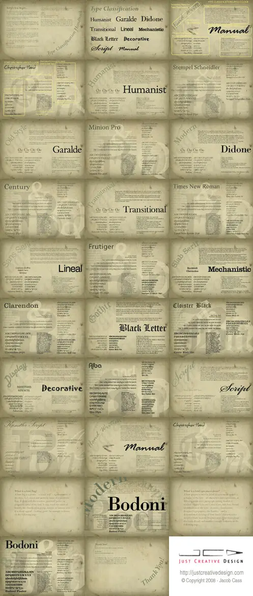
What is a Font Flag? What is a Font Specimen Sheet?

Written by Jacob Cass on Monday, March 17, 2008 – 9:41 am -

Font Flag

Do you know what a font flag or font / type specimen sheet is? Here are the answers as well as an example made by myself for typography class at university.

What is a Font Flag?

A font flag is a poster – a visual ‘sell’ – presentation of the style, feel, mood and aesthetic sense of a particular font. It deals with the emotive, pictorial, poetic or pragmatic sense of the font. It may recall the sense of history, the classification group, notable or famous uses. It is about appeal – looking good.

What is a font specimen sheet?

A font specimen sheet is about measurement specifics, display of the font – all characters and expressions, at differing point sizes, paragraph setting, leaded or tracked. Upper Case and Lower Case, title box, formal identification of the font - its name, classification, designer/typographer, the foundry – and a demonstrated showing of ‘font family’ characteristics – weights/shade in print.

My take on making a font flag and specimen sheet

For typography class at University we could choose any typeface we wished and then we had to make up a font flag and a font specimen sheet, here is the result, as well as a title page.

I chose Bodoni because it is so unique and because I wanted the challenge of working in an Didone (Modern) font, something I have never done before.

I made the background in Photoshop from about 8 different layers, then merged them and imported into Illustrator. The rest was done in Illustrator. You may notice that the Fibonnaci Sequence or golden mean has been the inspiration for these designs.

The characteristics of a Didone (Modern) type face.

  • Thick vertical strokes.
  • Thin horizontal strokes.
  • Fine hairlines.
  • Straight serifs.
  • Extreme contrast between the thick and thin stokes.
  • Curved letters balanced and slightly compressed.
  • The angle of stress is vertical.
  • Prints best on a smooth matt finish, white paper with black ink.

A thing worth noting on most digital Bodini fonts is that they suffer from a particular kind of legibility degradation known as “dazzle” caused by the alternating thick and thin strokes, particularly from the thin strokes being very thin at small point sizes. For more info on this see Bodoni on Wikipedia.

Bodoni Font Flag

Bodoni Font Flag

Bodoni Font Specimen Sheet

Bodoni Font Specimen Sheet

Typography Title Page (For a little typopgraphic pdf book we are creating.)

Typography

Need to brush up on your typography skills?

Feedback / Suggestions / Constructive Criticism is appreciated. I would love to hear your feedback.


Related Articles:

Tags: ,
Posted in My Work, Typography, University |


26 Responses to “What is a Font Flag? What is a Font Specimen Sheet?”

  1. 4Avatars v0.3.1 By inspirationbit (41 comments) on Mar 17, 2008 | Reply

    oops, I think my comment was just flagged as a spam. Hope it got through.
    Just in case: here’s what I wrote in the previous comment:
    Very nicely done, Jacob. Did you get an “A” for this assignment? I bet you did.
    I like the aged look of the poster and the Nautilus shape based on the Fibonnaci Sequence.

    I even wrote a post on my blog long time ago: Why Seashells Are So Alluring? where I was talking about Golden Number.

    inspirationbit’s last blog post..Behind The Scenes Of Exquisite Web Typography - Part Two

  2. 4Avatars v0.3.1 By zach (5 comments) on Mar 17, 2008 | Reply

    really cool. im just getting into typography myself, and those were really cool, well designed pieces. i could totally see them as a desktop wallpaper even.

    btw, whats the pdf book about? is it something you could post on the blog to look at? just wondering.

    cool stuff, keep it up.

  3. 4Avatars v0.3.1 By Miami Web Design (1 comments) on Mar 17, 2008 | Reply

    Interesting to know! Now I finally know what to call those things!

    Erika

  4. 4Avatars v0.3.1 By Jacob Cass (397 comments) on Mar 17, 2008 | Reply

    Hi Zach,

    Yeah I am getting more and more into it as the course goes on. Interesting stuff! A Wallpaper eh? That is an idea.

    The PDF book I will post up at the end of my typography course. It is about classifying and using type as well as various exercises on type. Something I can see using even 20 years from now.

    Hi Erika, Glad you now know :)

  5. 4Avatars v0.3.1 By Jacob Cass (397 comments) on Mar 17, 2008 | Reply

    Yes Vivien both your comments were in the spam folder, I dug it out from the 80 other ones in there. For some reason your link linked back to this article but I fixed it up.
    I haven’t handed in the project yet, those 2 pages are part of the pdf book we are creating. But I am aiming for high marks not that it matters to me, it is more about what I learn through the process.

  6. 4Avatars v0.3.1 By Andrew Greig (6 comments) on Mar 17, 2008 | Reply

    Great design there Jacob, Type despite what many people realise is sich an important skill to master in any Design related proffession.

    Keep up the great work, and thanks for the comment link on “Most Inspired.com’ Much appreciated!

  7. 4Avatars v0.3.1 By zach (5 comments) on Mar 18, 2008 | Reply

    really cool pdf. i can’t wait to get a look at it. definitely something extremely useful.

    thanks.

  8. 4Avatars v0.3.1 By inspirationbit (41 comments) on Mar 18, 2008 | Reply

    I wonder what happened to the link, why was it linking back to your site. Anyhow, thanks for digging out my comments from spam, Jacob.

    Look forward to seeing what your pdf book is all about. It must be exciting to take such interesting courses.

    inspirationbit’s last blog post..Behind The Scenes Of Exquisite Web Typography - Part Two

  9. 4Avatars v0.3.1 By Niyaz PK (15 comments) on Mar 18, 2008 | Reply

    Good work Jacob.
    Many things to learn here.
    Can you explain how you used the golden mean in the design?

    Niyaz PK’s last blog post..Blogger Sucks

  10. 4Avatars v0.3.1 By Jacob Cass (397 comments) on Mar 18, 2008 | Reply

    Andrew, Thanks for the feedback. Well when you think about it, the first ‘graphic designers’ were actually typographers so no wonder it is so important.
    No worries about the link, I was surprised it was not there.

    Zach, the pdf should be done within 10 weeks at the conclusion of university. It could be earlier.

    Vivien, I will let the readers know about it once it’s finished :)

    Niyaz PK, if you have a read of the wiki link I provided and come back and look at the designs you will see it straight away. :)

  11. 4Avatars v0.3.1 By Lakshmi Mareddy (3 comments) on Mar 19, 2008 | Reply

    Jacob! Lovely, lovely work! I liked the specimen sheet the best, because of the little notes on the typeface.

    Going through this article, i wanted to bring to your notice, the work of Jeremy Pettis, a final year design student at the Milwaukee institute of art and design. He made some noise on the web last month. I blogged about it in my blog, take a look.

    I think you may get some ideas..

  12. 4Avatars v0.3.1 By Jacob Cass (397 comments) on Mar 19, 2008 | Reply

    Actually the font flag has some notes on the type face too however it is in a different colour so it may have been harder to read. Maybe I should have put the full size up.

    Nice link on Jeremy, has some cool and creative ideas there. I imagine he only did one word for each animal?

  13. 4Avatars v0.3.1 By Niyaz PK (15 comments) on Mar 19, 2008 | Reply

    Thanks for the link, Jacob.

    Niyaz PK’s last blog post..Use International Date Formats

  14. 4Avatars v0.3.1 By Lakshmi Mareddy (3 comments) on Mar 20, 2008 | Reply

    Jacob, I think he did one animal per type face.. But as a concept it was cute don’t you think? Now I wonder why I cant see my “fotu” or rss feed in the comment?

  15. 4Avatars v0.3.1 By Jacob Cass (397 comments) on Mar 20, 2008 | Reply

    Yeah it is great work! Not sure about your photo? Bit strange.

  16. 4Avatars v0.3.1 By LaurenMarie - Creative Curio (73 comments) on Mar 27, 2008 | Reply

    Ok, I’m debating admitting this to the world but… here it goes.

    I had to do one of these in school, too. We just called it a type poster. I was pretty proud of the one I created. When we presented them for critiques in front of the class no one really commented either way on mine. I was very eager for critiques so I could improve my skills so after class I went up to the professor and asked him what he thought.

    He kind of looked at me suppressing a little laugh. “It’s great!” he said.
    “No seriously! There has to be something I can do better!” I insisted.
    “Eh… no, it looks good to me!”

    I walked out of class feeling rather proud that the professor couldn’t find anything that needed improving on my poster. I still had that nagging feeling though that there was some joke I didn’t get because of his little smirk.

    Oh how embarrassed I feel now that I know.

    LaurenMarie - Creative Curio’s last blog post..Fast and Easy Ways to Create Custom Grunge Textures

  17. 4Avatars v0.3.1 By Jacob Cass (397 comments) on Mar 27, 2008 | Reply

    That’s hilarious! Glad you had to heart to show it. Made my day anyway haha! At least it wasn’t comic sans I suppose.

    I actually nearly made a huge mistake myself on this project with Bodoni. On every page I had written Bodini and I hadn’t noticed it, even with it smack bang big on the page but luckily I picked it up after I printed it on the home printer.

  18. 4Avatars v0.3.1 By LaurenMarie - Creative Curio (73 comments) on Mar 27, 2008 | Reply

    Papyrus is just as bad (if not worse!) than Comic Sans. I see it everywhere in all the wrong applications. It’s horrid! I’ve only seen it once in a situation where it sort of worked.

    Heh, it’s a good thing you caught that mistake! Trust me, it will happen again, unfortunately. I once got the YEAR wrong on a project. It was proofed so many times and no one caught it. Even after it went out, no one phoned it in (this is when I worked for a small non-profit and our people even complained about tiny grammar mistakes in our publications). I really shouldn’t have mentioned it to the project manager after the fact…

    LaurenMarie - Creative Curio’s last blog post..Fast and Easy Ways to Create Custom Grunge Textures

  19. 4Avatars v0.3.1 By David Airey (39 comments) on Mar 27, 2008 | Reply

    Great work, Jacob! Thanks for sharing it with us.

    David Airey’s last blog post..Personal blog logo designs

  20. 4Avatars v0.3.1 By Jacob Cass (397 comments) on Mar 27, 2008 | Reply

    I always see Papyrus in landscaping and nature articles and ‘brands’.

    Even a search on Google turns up 245,000 results on Bodini so I am not the only one that has written that!

    What did the project manager say about it when you told them?

    Your welcome David.

  21. 4Avatars v0.3.1 By LaurenMarie - Creative Curio (73 comments) on Mar 28, 2008 | Reply

    Oh she was just really upset and stressed out about it because she didn’t want backlash from the people we sent the invitation to (the project was an invite to an awards event). But as far as I know, no one caught it.

    It was a confusing thing because the event was in the year after the year the people earned the awards. So the invite should say “2007 award recipients honored in June 2008,” for example. The invite instead read “2008 recipients honored in June 2008.” But designers really aren’t responsible for copy like that. We just lay out what they give us!

    LaurenMarie - Creative Curio’s last blog post..Fast and Easy Ways to Create Custom Grunge Textures

  22. 4Avatars v0.3.1 By Jacob Cass (397 comments) on Mar 28, 2008 | Reply

    Ah that is bit of a finer line! We could always check the copy however if something doesn’t sound right. At least no one caught it.

  23. 4Avatars v0.3.1 By Happy (1 comments) on Jul 25, 2008 | Reply

    hi! I just have a question. Can a font flag have images to help showcase the mood of the font? By the way, by image I do not mean blatant images in squares and rectangles, I mean just minimal and well-thought-of images.

  1. 3 Trackback(s)

  2. Mar 17, 2008: » Positive Space Community Roundup :: Blog Archive :: Positive Space :: Discussions on Culture, Design, Technology, & Music ::
  3. Mar 31, 2008: The Top Best Graphic Design Articles from March 2008
  4. May 4, 2008: How To Establish A Successful Online Business Presence » Inspiration Bit

Post a Comment