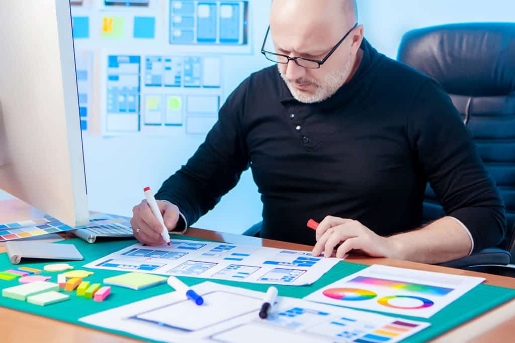
This is a guest article written by Lauren Marie who is a graphic designer in corporate America.
Want to know how to design? Then you should learn the basics of graphic design.

The basic elements of design include colour, line, shape, scale, space, texture and value and these are the fundamental pieces that make up any piece of work. If you ever start a design course this will be the very first thing that you are taught, guaranteed.
But what if you’re not a student? What if you’re not self-taught? What if you are a looking for ways to enhance your design skills? Then this is the guide for you.
Learn Graphic Design Online
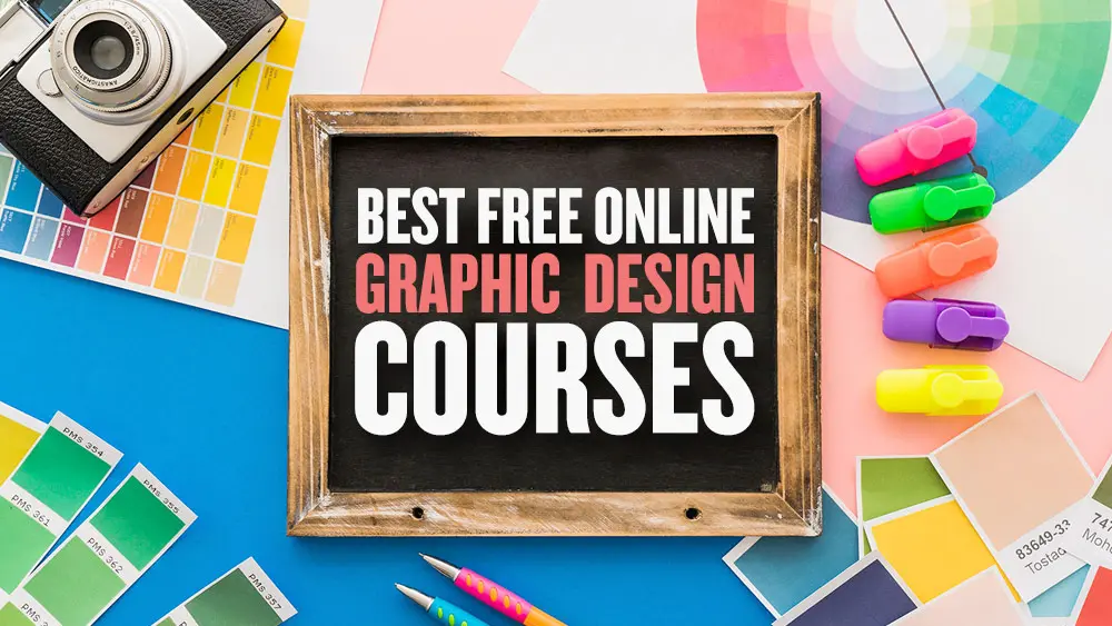
If you’re wanting to learn the basics of graphic design, we have a post featuring the best free online graphic design courses including short classes (1-3hrs) and more in-depth courses as well.
Free Software to Learn Graphic Design Basics
If you’re learning graphic design, you should know that Adobe provides the industry-standard graphic design software for creative professionals and that they offer free trials as well as some generous student discounts allowing you to save up to 65%.
Adobe offers a subscription service called ‘Creative Cloud’ which gives you access to several powerful design applications including Adobe Photoshop, Illustrator, InDesign, and more.
- Download a free Photoshop trial for PC, Mac, or iPad now
- Download a free trial of Illustrator for PC, Mac or iPad now
Graphic Design Basics: Design Principles & Elements
Normative Visual Design Guidelines
Designers sometimes disagree over the guiding principles of graphic design, as was already mentioned. The first twelve visual design ideas are most frequently discussed in books and articles on the subject, and these are the ones discussed here. The basic design elements include color, line, shape, scale, space, texture, repetition, and value. Let’s dive in!
Colour and contrast

Colour has a huge impact on the mood of the design. A predominantly red colour usually represents strong emotions—love, anger, passion—while blue can make the design feel calm, cool and peaceful. Color contributes to the unity of a series of flyers, emphasizes important information and leads the eye through a design.
One of the most common problems designers encounter with regard to client feedback is when customers say that a design needs to “pop” more. Even though the customer’s statement may appear completely arbitrary, they are typically referring to the need for more contrast in the design.
Contrast denotes the arrangement of diverse parts within a design, especially those that are close to one another. These differences cause various elements to stand out. Contrast is a key element of designing for accessibility. When there is little contrast, it can be very difficult to see text, especially for people with visual problems.
Select articles on color:
- Using Colour: Real World Examples
- The Colour Wheel and Color Theory
- Pantone Swatches on Squidoo
- Color Wheel – Color Theory on Canva
- The Best Colour Tools Online
Line

Are your lines straight and slim, or thick and squiggly? The quality of the line (hand drawn to precise) can say a lot about the mood you are setting with your design. Hand drawn or thick lines tend towards juvenile themes, where as straight and thin lines are more refined, corporate or intelligent.
How lines interact with each other is important, too. If they are straight, thin lines, but are colliding at all sorts of crazy angles, that is going to be chaotic. If they have a hand drawn quality to them but are more or less straight and orderly, this can give a much needed personal appeal to a design.
Select articles on line:
Shape

Besides the fact that shapes can be used to convey moods, did you know they can elicit emotions as well? A square or triangle is a masculine shape, while a circle is more feminine. We are familiar with squares (think of your monitor, paper or TV screen), so they are secure, reliable, and stable. Circles very pleasing to the eye and are organic, whole, peaceful and exude unity.
Select articles on shape:
Repetition
Repetition is a powerful way to reinforce a concept. It’s also a great way to assemble a design with a variety of intricate parts. One way to use repetition in design is by repeatedly using the same colors, typefaces, shapes, or other elements.
For instance, this article’s heading format is repetitive. Readers are made aware of the importance and interconnectedness of each design principle in this section by the uniform layout used throughout. By uniform headers, these components are unified over the entire page.
Scale and Size

Bring balance, proportion and contrast to your designs with scale and size. Just for reference, size is the actual dimensions of an element on the page, scale is the element’s relation to its original (like putting a person on a billboard—it’s going to be “larger than life”) and proportion is the relation of all the elements on the page in terms of size and scale. Use scale and proportion to indicate the actual size of an object or to emphasize the difference in the sizes of two objects (a child’s hand against its mother’s is a common use of size).
Select articles on scale/size:
Using Scale: Real World Examples
Space

Space is often referred to as white space, and gives the design some breathing room and the eye a place to rest. An ill use of space (or perhaps a very well planned out use) can make the design feel crowded and claustrophobic. Too much space, however, and the design can seem unfinished, like it’s missing something. Once you know the rules (for any of these elements, really), you can also experiment with breaking them in order to push a different emotional response.
Select articles on space:
- Using Space: Real World Examples
- A List Apart: Whitespace
Texture

Texture is a fun element to experiment with and use to bring realism to your designs. It can be effectively used to add visual interest and it really helps make a design unique. Textures are not just applied in the computer; you can take into consideration the materials used in the final printed pieces, too.
Select articles on line:
- Using Texture: Real World Examples
Value

Value can really add unity to your designs if you pay attention to this neglected element. It is also a great way to create a focal point and guide the viewer’s eye through the layout. This little element can bring together parts of the design to make them balanced; using elements similar in a high intensity value (light, towards the white end of the spectrum) can create a subdued tone, where values lower in intensity (darker, towards black) can be ominous and foreboding. Using values on either extreme of the spectrum has a very dramatic effect.
Select articles on value:
- ArtLex: Value
The Purpose of Graphic Design

What “fundamental” design concepts are is surely up for debate. The aforementioned ideas must be understood and applied in order for any design effort to be effective.
The purpose of graphic design is communication. As you go through each stage of your design process, ask yourself how you are using each of these elements of design to enhance the delivery of the message, affect the mood of the piece and relate the product or message to the target audience. Remember that these elements apply to everything in the layout, from composition, to photos, to typography.
We hope our guide to graphic design basics will help you with your creative endeavours! The designer should be aware of the precise effects each of these design principles has on their work. Seeing how other designers have incorporated related principles to organize their own designs may be a tremendously useful technique for learning to develop better designs.


Great article. I enjoyed it!
Yes, I can agree to the others: Very helpful! Thanks a lot!
Okay, I appreciate what you are trying to do here, but what you are talking about is the actual design process, not design.
Design is more than a collection of references. The only way to become a designer is through education, experience, and questioning the world around you. If you do not have an opinion about your door handles in your home, you will probably never be a designer or be able to design – This is the unfortunate curse of Graphic Design.
“Designing is not a profession but an attitude. Design has many connotations. It is the organization of materials and processes in the most productive way, in a harmonious balance of all elements necessary for a certain function. It is the integration of technological, social, and economical requirements, biological necessities, and the psychological effects of materials, shape, color, volume and space. Thinking in relationships.”
Laszlo Moholy-Nagy, Photographer, Graphic Designer, Co-Founder, Bauhaus
The pictures in this post are brilliant. I love design blogs that burst with inspiration.
It’s beginning to occur to me that you can’t just ‘talk’ about design, you’ve got to illustrate it.
Thanks for a great post,
Tom
[This is the second post from JCD I’ve found via del.icio.us. Loved both of them. Subscribed to feed!]
Great article, now I am just going to have to find the time to get some work done in between digging through all of this.
Jeremys last blog post..Rub a Little Dirt on It
Great article, Lauren–nice summary of some basics. As someone who has no formal training in Graphic Design, I have had to learn a lot of this by trial, error, and inspiration. A great book to get some of the basics is “The Non-Designer’s Design Book” by Robin Williams.
Don’t forget to Float the article, everyone!
Jeffrey, Jeremy,
Thanks! Glad you enjoyed it!
Chad,
Even those of us with a design degree still learn most of what we know through experience! I have heard mixed reviews about the Non-Designer’s Design Book, but it’s not terribly expensive (about $20 USD) so perhaps I’ll just pony up and get it. Thanks for the Float, too!
LaurenMarie – Creative Curios last blog post..The Quick and Easy Guide to Color Correction Part 1
brief.
informative
and on point.
well done!
Mokokomas last blog post..Interview by Neo Dhlamini
@Ben
I don’t agree with your statement concerning this post. Yes people have design inside them and its something learned through experience but Lauren is referring to the first things you learn when taking an education.
The part about values is something people neglect when designing and can impact things drastically. Just look at this blog the colors are different values of Black and Red. I try never to use full values of colors in my designs sometimes just a little off can make it amazing.
modemloopers last blog post..What Happens When Bloggers Unite?
Well, as a right-brained non-desinger type I must say that I appreciate your efforts.
Some of the things you bring up like color and lines and texture would never even occur to someone with as shallow designing skills as myself. But just the fact that I am being made aware of the facts and details of good web design will make me pay attention to them and thus make me better.
I’ve bookmarked your blog (and Jacob’s too!) and will be refering back to them for some much needed inspiration.
Mokokoma,
Thank you!
Ben,
I appreciate your willingness to disagree. I must disagree with you, however, that this post is on the design process. The design process is thumbnails, comps, revisions, etc. This post is on the education and questioning you are talking about. And I do not question my door handles. Nor my kitchen counters nor the toilet seat. Does that mean I’m not a designer? It’s nice to throw quotes of famous people everywhere, but that doesn’t necessarily mean their view is “right” or that it is the only acceptable view. It would be better to hear your own ideas and thoughts on the matter instead of someone else’s.
Modemlooper,
Thanks for your insights. Interesting that you are so aware of your use of value! That’s probably the one I forget about the most.
Thomas,
Awesome! Pleased you were inspired.
LaurenMarie – Creative Curios last blog post..The Quick and Easy Guide to Color Correction Part 1
Useful…
web design companys last blog post..Creative Advertisements
I’m gonna have to agree with Ben here on this one. Design is so much more than a list of elements which contribute to the final work. Technical ability and ontological analysis will only get you so far. You need to be considering design as something much deeper. Gestalt if you will.
I will agree, however, that this isn’t about design process. If you REALLY want to teach someone how to ‘design’ you probably wouldn’t refer to the modes of communication at any point. You will talk about thought processes. How to get to solutions to will work for a client. When a design is finished etc.
Otherwise, a good article for beginners 😉
Anthony Shorts last blog post..Dynamic CSS layouts in 5 minutes
Great article, every designer should read this. Especially seasoned vets who need a refresher.
As for the ongoing discussion, well I think you’re all right (or all wrong). You have to look at your design from a technical point of view, the elements that go into it, the processes.
I think Ben and Anthony take it too far in suggesting that a single-minded point of view is necessary for design. It’s the opposite. Any great design most likely has a number of considerations involved and it would be very difficult to create anything without using the elements that were discussed in this primer
Great Article
Fredriks last blog post..Wordbook and Armin van Buuren ASOT ep 356
@Sketchee – I think you’re missing the point of what I was saying.
“I think Ben and Anthony take it too far in suggesting that a single-minded point of view is necessary for design.”
This isn’t what I meant. Its quite the opposite. I mentioned gestalt – the whole being greater than the sum of its parts – all the elements design coming together to form the final design.
These low-level components only make up the simplest level of design. Until you factor in culture, audience, expectations, emotional response – not to mention context – you won’t ever find a great design. “Always consider a design in relation to its next larger context”.
Design is much more complex than it appears. I mean no disrepect to the author. It’s still a great article about the principles of design. I’m just arguing that design is deeper.
Anthony Shorts last blog post..Dynamic CSS layouts in 5 minutes
WOW! Again a great article.
Now i have to analyze a day to understand what is written here. And i know this will be great to improve myself. Thanks a lot.
petnoss last blog post..Türkiye – H?rvatistan Euro 2008 Çeyrek Final Maç?
Great article about the basic for design. Thank you.
Ralph
Always good to remind ourselves of the basics, thanks.
Barrys last blog post..Degree Show Comments
Phil,
Don’t get so down on yourself! You have to start somewhere and the basics is a great place. Just start with being aware of your use and other people’s uses of each of these elements.
Anthony and Sketchee,
Thanks for your points of view and the following conversation.
Anthony, this was meant to be an overview of the basics of design, and I think you picked up on that from your comments. If a designer doesn’t know where to start, it can be pretty overwhelming to begin any design!
I find that breaking designs down into these components also helps me analyze layouts that I think are good and learn how they’ve used each of these basic elements so that I can improve my uses, too.
You’re definitely right, though, that design does have to take into consideration the audience, culture, etc. But now that I think about it, wouldn’t that be more along the lines of marketing? I guess that’s another blurry line where design meets other disciplines (seen similarly where design meets art/illustration, user interface design, usability, copy writing, etc).
LaurenMarie – Creative Curios last blog post..Photoshop Action Freebie: Light Writing Effect
Juan,
I didn’t know that! Thank you for enlightening us 🙂
LaurenMarie – Creative Curios last blog post..The Quick and Easy Guide to Color Correction Part 2
Great article!
I’d like to add, as a curious fact, that white space is also very important in optometry, because people with lazy eye (amblyopia) suffer from crowding effect in a greater way compared to “normal” people. This is vital when designing visual acuity charts.
I had bookmarked this post a while ago now, and finally got back to it. Very well explained. thank you very much. Great reading.
Thanks for compiling this, I’ve referenced it several times. love your blog!
Thank you very much for publishing this. Was very helpful. I recommend this to a lot of people
One more interesting article from your end.. good job.. keep it up..:-)
Very good article – simple, basic and efficient!
Thank you.
thanks. i’m a writer dabbling in graphic design and this overview as helped, like, totally.
Hi, Jacob, I just want to say that your article is very interesting, I want to know if you let me use it in my little blog, I’ll just translate to spanish your article. cheers!
ddnewbie.blogspot.com
Hello Diana,
Please ask Lauren, the author of the article, thank you! Otherwise it is fine with me.
http://laurenmarie.net/index.php is this the Lauren’s website?
Diana,
http://creativecurio.com – great website too!
Hi, Jacob, this is the Lauren’s article (translated into spanish) 🙂 my blog is new but here is the link:
http://ddnewbie.blogspot.com/2009/04/quieres-saber-como-disenar-aprende-lo.html
Cheers!
This is great! Thanks Jacob 🙂
Very good 🙂
Very helpful for beginners. Wish I would have found this when I first started.
This is a very cool post. And very helpful for learning the designing. I like to recommend this to all my friends. I also recommend GFXBD for free icon, logo and other graphic related element.
Ok Im late to the party here, but the title should read “Want to know how to design… then go to college and learn!”
I am fed up of so called designers coming into the industry and devaluing the skills that real designers have. If that sounds pompus, then I won’t be apologising, I personally spent 5 years at college and university and then 20 years in the industry learning at every rung of the ladder.
The industry is becoming flooded with people from other professions who have got hold of a copy of photoshop and dreamweaver and suddenly theyre a designer, and to be honest one look at their work says it all. They may have undercut the guy that can design by loads, but the damage done to the industry as a whole is far worse, customers expect designers to share their expertise for pittance!
In case you were left wondering this is a subject which winds me up!
Good luck to all of those that can design, and find another profession to those of you that can’t!
Hi Jacob. Excellent article. Some of the links to Lauren’s site are not working.
This is a wonderful guide for basics of graphic design. Choosing proper colors is my weakest point but I found here great articles about colors. Is my first time here … good job!!
Dan – Romania
Great post for the beginners. I liked your site. I have been looking around this article really helps! Cool!!!
This is exactly what i was looking for.. Great thanks!!!
A very special “Thank you” from Egypt =) … I found here what I’ve been looking for =)
Great post. Lot’s of goodies.
Thanks! Very nicely tutorial, will definitely use it 🙂
It is interesting.
Very good and useful articles for Visual Design principles. Thank you.
Thank you so much, it was just what I was looking for 😀