
Get ready to be inspired, graphic designers!
Here is our round up of the best graphic design trends for 2024 as outlined by ten prominent design blogs.

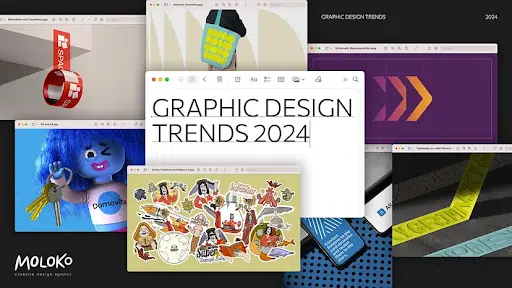
Graphic Design Trends 2024: Round Up
Below we feature the graphic design trends as outlined by ten prominent design blogs:
- Rawpixel: Graphic Design Trends to Watch Out In 2024!
- Muzli by Medium: Graphic Design Trends 2024
- Piktochart: Vibrant Graphic Design Trends to Watch in 2024
- Creative Bloq: Graphic Design Trends 2024
- Venngage: The Biggest Graphic Design Trends for 2024
- Creativeboom: The biggest trends in graphic design for 2024
- Looka: Graphic Design Trends for Cutting Edge Design in 2024
- The Influence Agency: Web & Graphic Design Trends for 2024 (And Beyond)
- Envato Elements: Graphic Design Trends for 2024
- JUST Creative’s Graphic Design Trend Predictions
With the new year stepping in, graphic design continues to evolve, reflecting the dynamic intersection of technology, culture, and aesthetics. Clean, original, and minimalist designs maintain their popularity, with an emphasis on simplicity and clarity.
Gradients and bold, vibrant colors are making a comeback, adding depth and energy to visuals. The integration of 3D elements and augmented reality in graphic design is gaining momentum, providing a more immersive and engaging user experience.
Hand-drawn illustrations and custom typography are finding favor, injecting personality and uniqueness into designs. Additionally, the interplay of bold geometric shapes and asymmetry is shaping modern designs, breaking away from conventional layouts.
Embracing inclusivity, designers are incorporating diverse and representative visuals, fostering a sense of connection and relatability.
As technology advances, we can anticipate graphic design trends in 2024 to be a captivating fusion of innovation, individuality, and environmental consciousness.
Let’s dive into the roundup!
Rawpixel: Graphic Design Trends to Watch Out In 2024!
- Retro Rewind: Revival of the 60s and 70s styles with warm hues, neon colors, bold lines, and pop art vectors.
- Geometric: Abstract and fluid geometric shapes and patterns for dynamic and modern visuals.
- Simple But Bold: Minimalism with a touch of color, emphasizing sleek and user-friendly designs.
- Multimedia Collage: Upgraded collage designs mixing media with tactile textures for an eclectic look.
- Abstract Brutalism: Gritty, minimal, and functional designs inspired by ’90s punk and alternative music scenes.
- Hand-Drawn Illustrations: Incorporating fun and unique doodles into corporate designs for a more personalized touch.
- Rise of Risograph: A mix of screen printing and photocopying, adding distinctive textures and colors to prints.
- Eco & Ethical Designs: Sustainability-focused designs with nature-inspired motifs and eco-friendly packaging.
- Be Authentic: Embracing realness and relatability in designs to connect with audiences.
- Inclusivity Matters: Celebrating diversity in races, genders, and abilities in design to reflect the real world.
Muzli: Graphic Design Trends 2024
- Minimalism and Cleanliness: Focus on simple, strong visual solutions with clean lines and limited color palettes.
- Typography as the Main Element: Innovative use of fonts and text compositions for uniqueness and expressiveness.
- Mixing Traditional and Digital Art: Integration of classical artistic methods with modern digital technologies.
- Multicultural and Inclusive Design: Emphasizing diversity and inclusivity in visual communications.
- 3D and AR: Development and integration of 3D graphics and augmented reality for interactive brand experiences.
- Risograph: Revival of the 1980s printing technique, now used for digital abstract graphics.
- Anti-Design: Going against traditional design rules with asymmetric shapes, bold typography, and dark color palettes.
- Working with a Subscription Agency: Designers offering package tariffs and fixed services through monthly subscriptions.
- Brand Sprints: Quickly assembling graphic solutions in a short period for fast-paced business environments.
- Kinetic Identity: Using kinetic typography as a central element of branding to emphasize dynamism and movement.
- Abstract Geometry: Adoption of “organized chaos” using abstract geometric shapes and compositions.
- Schematic Representation: Conveying complex concepts through clear visual stories using schematic representations.
- Eco-Orientation: Seeking environmentally friendly design solutions that emphasize organic feel and sustainability.
![]()
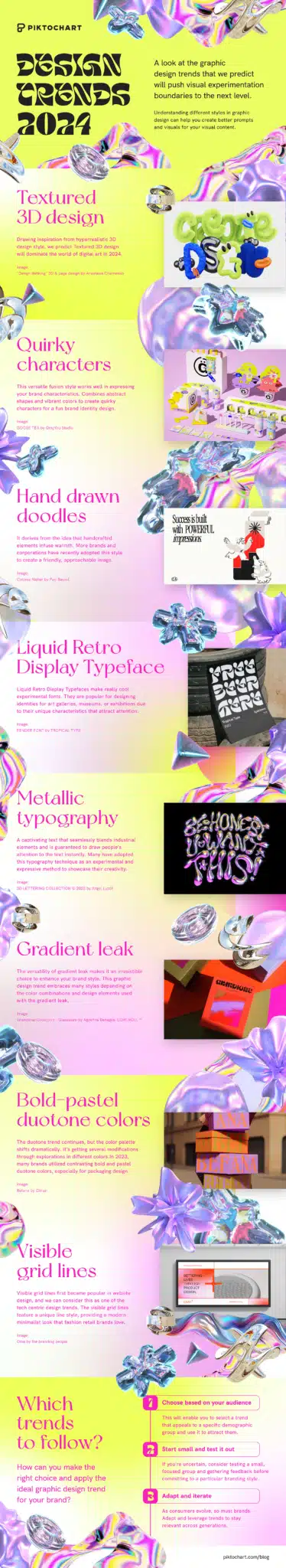
Piktochart: Vibrant Graphic Design Trends to Watch in 2024
- Fusion Design of AI-Generated Visuals: Utilizing generative AI to boost content quantity and creativity.
- Textured 3D Design: Hyper-realistic 3D design with a focus on texture, especially in AR and metaverse applications.
- Quirky Characters: Character illustrations with fluid-like bodies and distinctive long limbs for a fun and unique style.
- Hand Drawn Doodles: Incorporating handcrafted elements for a friendly and approachable brand image.
- Liquid Retro Display Typeface: Bold stem and delicate liquid-style stroke and tail, suitable for art galleries, museums, or exhibitions.
- Metallic Typography: Adding a 3D texture to text with liquid font for a captivating metallic effect.
- Gradient Leak: Versatile gradient style with various color combinations for different brand styles.
- Bold-Pastel Duotone Colors: Combining exactly two contrasting colors for a distinctive design or artwork.
- Visible Grid Lines: A minimalist look with a unique line style, suitable for digital media like apps, websites, or social media.
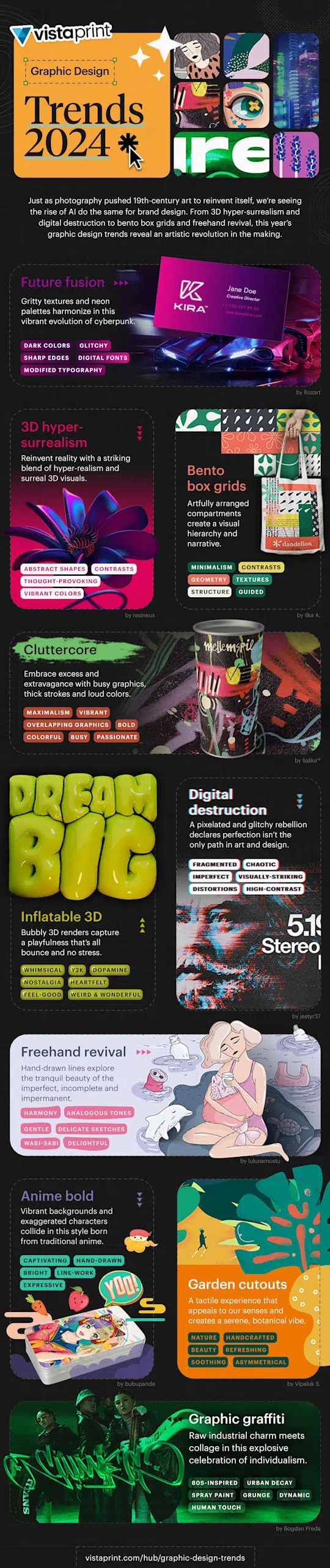
Vistaprint: 10 inspiring graphic design trends for 2024

- Future Fusion: A blend of futuristic and relatable designs with a color palette of deep browns, blues, blacks, and vibrant neon purples and pinks.
- 3D Hyper-Surrealism: Combining hyper-realistic and surreal 3D designs with abstract shapes, vibrant colors, and experimental fonts.
- Bento Box Grids: Artful arrangement of boxes in varying sizes to house information or graphics, resembling Japanese bento boxes.
- Cluttercore: A bolder, louder, and more colorful form of self-expression, embracing excess and extravagance.
- Inflatable 3D: Nostalgic designs reminiscent of the 2000s with bubblegum colors and iridescent schemes.
- Digital Destruction: Embracing pixelation, fractured typography, and distortion as a counterargument to clean and tech-centric designs.
- Freehand Revival: Hand-drawn lines with imperfections and gentle wobbliness, using soothing color palettes for a tranquil design.
- Anime Bold: Bright, bold, and vibrant colors in animated and exaggerated anime-style illustrations.
- Garden Cutouts: Designs inspired by nature, using shapes and colors reminiscent of plants, flowers, and leaves.
- Graphic Graffiti: Modern aesthetic drawing inspiration from graffiti and the neon energy of the 80s, featuring spray-painted text and symbols.
Creative Bloq: 9 Hot Graphic Design Trends for 2023

- Digital Dreamscapes: Hyper-realistic and beautiful places that transport users into the brand’s world, used by both tech and consumer brands.
- Sharp and Angular: Inspiration from cyberpunk, sci-fi, and dystopian aesthetics, with a focus on sharp angles and amorphic shapes.
- Platform-Agnostic Aesthetics: Designs that flow across platforms and dimensions, creating fluid visual identities.
- More is More: A mix of analogue and digital techniques, clashing colors, and overlaying photography with expressive type and illustrations.
- Sober-Curious Drinks Branding: Promoting zero-alcohol drinks with inventive and thoughtful design aesthetics.
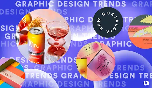
- Nuanced Nostalgia: Brands revisiting historic assets and bringing them to the present day with a modern twist.
- Multidimensional Visual Identities: Thinking beyond colors, shapes, and typography to include space, developing flexible identities across platforms.
- Carbon-Conscious Design: Using less energy-intensive colors and simple vector illustrations to reduce the digital industry’s carbon footprint.
- Metaverse Influence: Combining physical and digital design elements to create fully immersive brand experiences.
Creative Boom: Biggest Trends in Graphic Design for 2024
- Subscription-based Agency Work: Agencies offering fixed monthly fees for unlimited design work.
- Brand Sprints: Agencies offering a single service for a fixed price, like creating a brand identity in two weeks.
- De-packaging and Sustainable Luxury: Focus on environmentally responsible packaging with minimalistic graphic design.
- The Rise of Moving Type: Kinetic and variable typography becoming central in brand storytelling.
- Real Meets Surreal: A trend towards surrealistic designs that blend reality with fantasy.
- Backlash Against AI: Possible movement against AI in creative work, favoring human-made designs.
- To BCorp or Not to BCorp: More studios seeking B Corp status for environmental and social responsibility.
- Products and Services Created by Designers for Designers: Designers create tools and products for their community.
Looka: Graphic design trends
- Diversity and Inclusion: Representing diverse and real people in designs.
- 3D Surrealism: AI-driven surrealistic and 3D designs.
- 70s Nostalgia: Retro designs inspired by the 60s and 70s.
- Maximalism in Composition: Loaded compositions with bold fonts and vibrant colors.
- Experimental Typography: Using fonts as the focal point with abstract lettering.
- Illustration and Animation: Rise of animated logos and hand-drawn illustrations.
- Anti-design: Breaking traditional design rules for a unique look.
- Vintage Minimalism: Simple vintage elements with a modern twist.
- Abstract Gradients and Color Transitions: Vibrant gradients and color transitions for a modern look.
- Texture and Senses: Incorporating real-world textures into designs.
The Influence Agency: Web & Graphic Design Trends for 2024

- Emphasis on UX, UI, and SEO First Websites: Prioritizing user experience, interface, and search engine optimization for effective websites.
- More Focus on Interactive Experiences: Incorporating interactive elements like videos, polls, and quizzes to engage visitors.
- Use of 3D Graphics and Claymorphism: Adding depth and realism through 3D elements and claymorphism for a dynamic user experience.
- Micro-interactions and Micro-animations: Enhancing user experience with small, impactful animations and interactions.
- Minimalism Meets Maximalism: Combining minimalist and maximalist design elements for a striking visual contrast.
- Typography Takes the Spotlight: Emphasizing creative typography to define brand personality and improve user experience.
- Amplified Accessibility: Focusing on accessible design for all users, including those with disabilities.
- Diagrammatic Representation: Using diagrams and visual representations to convey complex information simply.
- Behavioral Design: Designing with user behavior in mind to influence actions like sign-ups and purchases.
- Adding Interest Where Least Expected: Implementing surprising design elements in unexpected places for a memorable user experience.
Envato: 2024 Graphic Design Trends
- Multimedia & Collage: Digital collage combining various mediums.
- Animated Design: Using animation to enhance storytelling and user experience.
- Interactive & Tactile Design: Designs that invite interaction, both digitally and physically.
- Online Brand Guidelines: Shift to digital, easily updatable brand guidelines.
- Apple Vision: Using Apple’s spatial computing device for immersive design experiences.
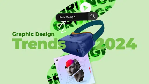
- Folk Design: Embracing simplicity and heritage in design.
- Grunge: A resurgence of the raw, edgy aesthetic from the 90s.
- AI Becoming More Accessible: AI tools aiding but not replacing designers.
JUST Creative: 8 Graphic Design Trends Set to Define 2024
1. Motion Graphics
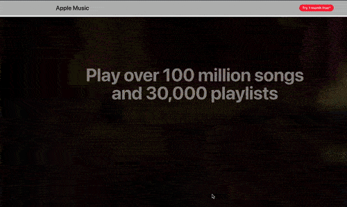
Unless you’ve been living under a rock, you’ve probably noticed that motion graphics have been popping up everywhere lately. And this is largely due to TikTok’s disruptive influence.
With brands flocking to the platform in hopes of capitalizing on its vast, highly engaged user base, graphic designers have followed suit. From social feeds to UX designs (like the Apple Music product page shown above), we’ll be seeing a lot more of this interactive trend in future creations.
So expect top brands to continue building identity through movement in 2024. And take the hint: now’s the perfect time to replace your static images with short-form video content instead.
2. Bold Abstract Shapes
A few years ago, geometric shapes started making the rounds — as brands sought to couch their content in graphics that add interest without distraction.
Well in 2024, guess what: bold shapes are back. The only difference? Sharp angles and stiff edges have given way to more abstract, rounded forms.
So join the likes of Trello, Slack and HubSpot by upping the visual interest in your designs. All you need to do is use punchy colors and freeform organic shapes, and this simple-to-implement trend will do the rest.
3. AI-Generated Art + AI Video
Have you played around with OpenAI’s DALL-E 2 yet? Since its public release, the AI powered image generator has impacted the design world in a huge way, influencing imaginative works and memes alike.
Despite concerns over copyright and the displacement of human creativity, it’s clear this trend isn’t going anywhere. And with notable brands like Microsoft and Notion releasing their own design tools featuring built-in DALL-E integrations, you can bet we’ll only see more AI art in the new year. (Especially considering OpenAI’s GPT-4, the next machine learning iteration set to launch soon!)
So why not take DALL-E 2 for a spin the next time you’re dreaming up creative assets?
4. 3D Elements

Newsflash: 3D is the new 2D. Considering the advancements in design tech that make high-quality renderings easier than ever to produce, it’s no surprise we’re seeing brands like IBM, Adobe, Later and Intel share more and more three dimensional graphics these days.
Combined with the growing desire for highly immersive product experiences, you can expect everything from logos, icons, typography and more to reach out to viewers like never before.
So give this trend a go in the new year. Even if you’re not a pro at rendering, you can certainly try this style out by bringing more depth, shadows and textures into your creative assets.
5. Inclusive Visuals
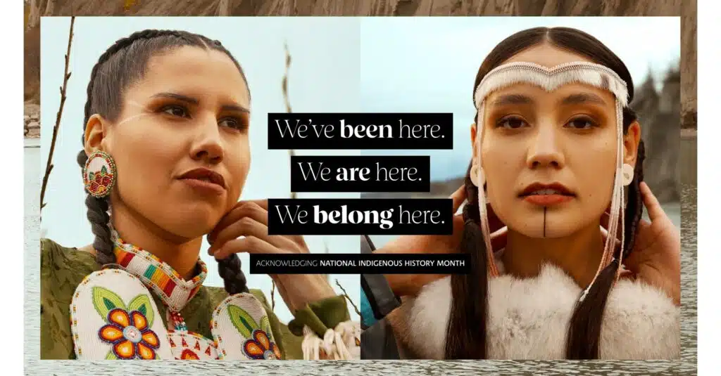
Representation matters. That’s why more brands are adopting inclusive design practices, in order to show viewers from all walks of life that they’re seen.
A key difference in 2024’s inclusive designs? Those with truly progressive visuals will go beyond ethnically-diverse icons and pride month advertisements. In fact, the new year will bring to light more gender diverse imagery (a la Pinterest), indigenous representation (like in the Sephora Canada advertisement above) and disability-friendly accessible designs (see Mastercard for inspo).
So differentiate yourself by prioritizing inclusive visuals, this year, next year, and beyond. Your viewers will surely appreciate your commitment to diversity.
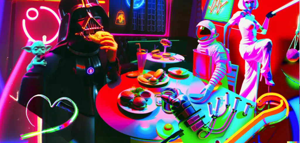
6. Surrealist Maximalism
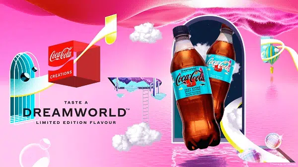
Reflecting our determination to break free from all restrictions post-pandemic, surrealist and maximalist aesthetics have taken hold. Think: larger than life psychedelic images with reality-bending elements.
From Coca Cola’s graphics to Adobe’s social feed, expect visual storytelling to reach new heights in 2024. Because minimalism and realism just won’t cut it.
So dare to defy the rules of physics and whitespace, and go big or go home with your designs. (Maybe #3 on our graphic design trends list can help you with that!)
7. Colorful Retro Illustrations
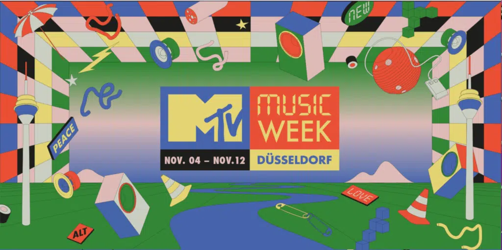
Need more evidence that the pandemic has brought about major changes to the design world? Look no further than the 90s throwback/vintage revival trend. After all, COVID had us longing for a simpler, familiar life — and brands like MTV, Google and Later reflected this by kicking it old school in turn.
From this summer’s viral trend of sharing Little Miss ____ sketches on social media, to the retro aesthetics now adorning packages and more, expect to see more trips down memory lane in the coming months.
So add some nostalgia to your future designs by looking to the past for inspiration. Because who doesn’t love a good opportunity to reminisce?
8. Virtual Reality
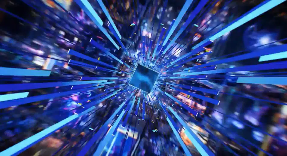
Meta’s (and the Metaverse’s) financial flounders aside, the virtual reality market has undergone staggering growth in recent years, with companies far and wide choosing to invest in Web3.
To reflect this, creatives are producing futuristic designs that showcase forward-thinking sensibilities. From Intel’s commercials (shown above) to Zendesk’s social posts, brands all over are buying into the art of immersive experiences.
So expect an influx of Blade Runner-esque image renderings, liquid gradients, 3D components and neon color palettes in the coming months.Looking to emulate the style? You can get in on this trend without knowing the blockchain inside and out. For starters, try including some neon accents, or any of these futuristic fonts in your own designs.
Graphic Design Trends 2024 Infographic
Designed by VistaPrint
Graphic Design Trends 2024 Conclusion
The graphic design landscape for 2024 promises a captivating blend of innovation, inclusivity, and sustainability. From the resurgence of bold gradients and vibrant colors to the integration of 3D elements and augmented reality, designers are navigating a dynamic space where creativity knows no bounds.
Hand-in-hand with these trends is a growing emphasis on eco-conscious design, bringing nature-inspired palettes and environmentally friendly motifs into focus. As the industry embraces diversity, we witness a shift towards more inclusive visuals, reflecting the rich tapestry of human experiences.
FAQs
1. How can I incorporate eco-conscious design into my graphics?
Consider using earthy color palettes, integrating nature-inspired elements, and opting for sustainable design practices. Look for eco-friendly materials and explore ways to communicate environmental consciousness through your visual choices.
2. Are 3D elements and augmented reality accessible for all types of graphic design projects?
Yes, advancements in technology have made 3D elements and augmented reality more accessible. Many graphic design tools now support the integration of 3D elements, and various platforms offer AR features. However, it’s essential to assess the suitability of these elements for your specific project and audience.
3. How can I stay updated on the latest graphic design trends for 2024?
Stay connected with design communities, attend industry events, and follow reputable design blogs and publications. Social media platforms are also valuable for discovering emerging trends and engaging with fellow designers. Keep experimenting with new techniques and tools to stay at the forefront of graphic design innovation.
Related Posts:
- The Best Printers for Graphic Designers
- Essential Graphic Designer Tools
- Graphic Design Fundamentals
- Best Budget Monitors for Graphic Design
- Best Graphic Design Software


Infographics have always been my favourite way for graphic designing as it has more info and color. But right now AI generated designs and 3D elements mentioned in the article are the must try designing ideas which will elevate the strategy of designing. Thanks for sharing this piece of information, Jacob. That’s some great work. Hope to see more of it.