The Best Adobe Creative Cloud Discounts & Deals: Get 40 to 70% Off
Looking for Adobe Creative Cloud discounts, sales & deals? Here are the best Adobe CC special offers + how to get a Creative Cloud discount at 40-70% off!
Looking for Adobe Creative Cloud discounts, sales & deals? Here are the best Adobe CC special offers + how to get a Creative Cloud discount at 40-70% off!
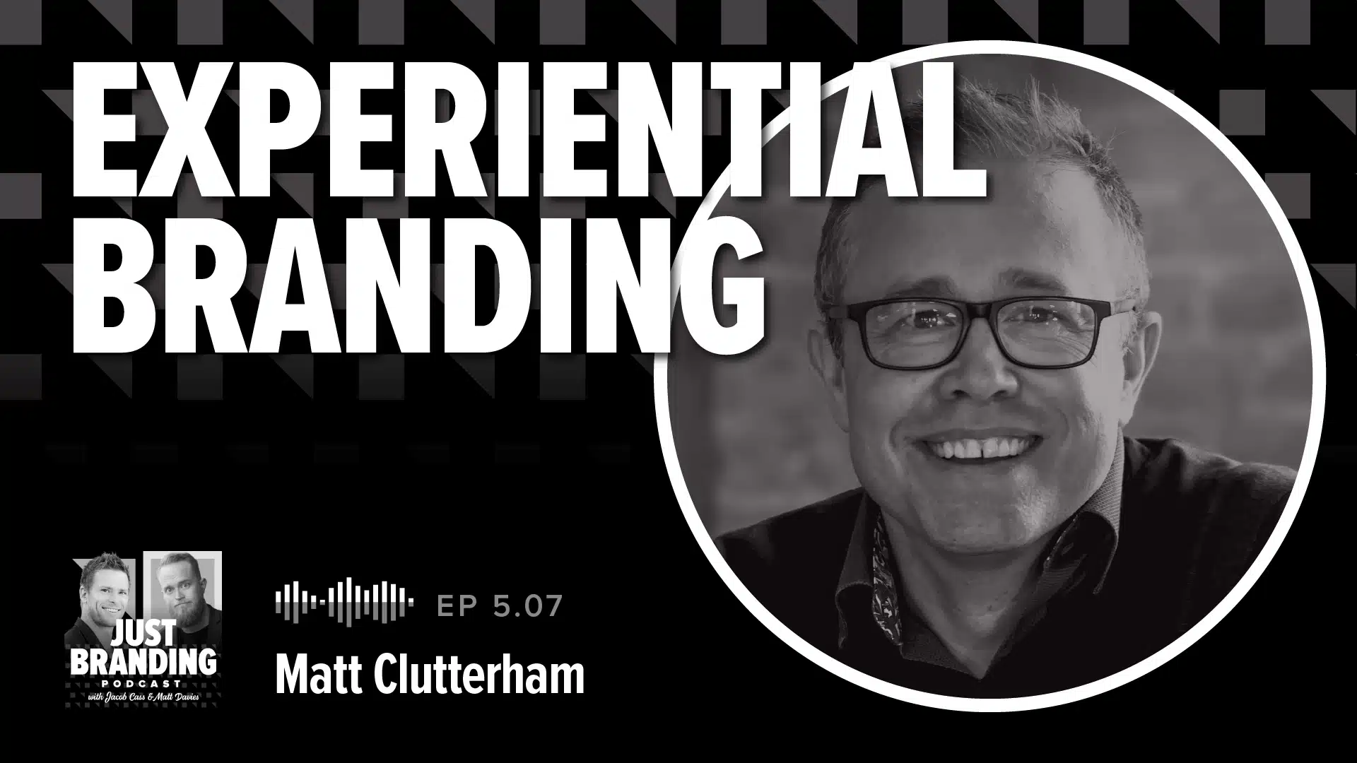
In this episode we sit down with Matthew Cluttingham who has been creating experiences for global brands for over 20 years.
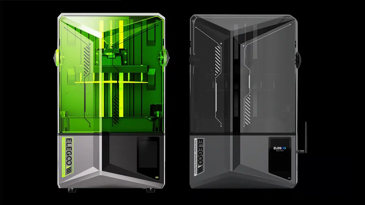
Let me tell you about ELEGOO. Back in 2015, I remember reading about this new company started by a bunch of whizzes from Shenzhen. They were all about creating cutting-edge … Read more
The days of paper and pencil are long gone. There are new tools and our list of the Best Tablets with Stylus Pen will help you craft a new era!
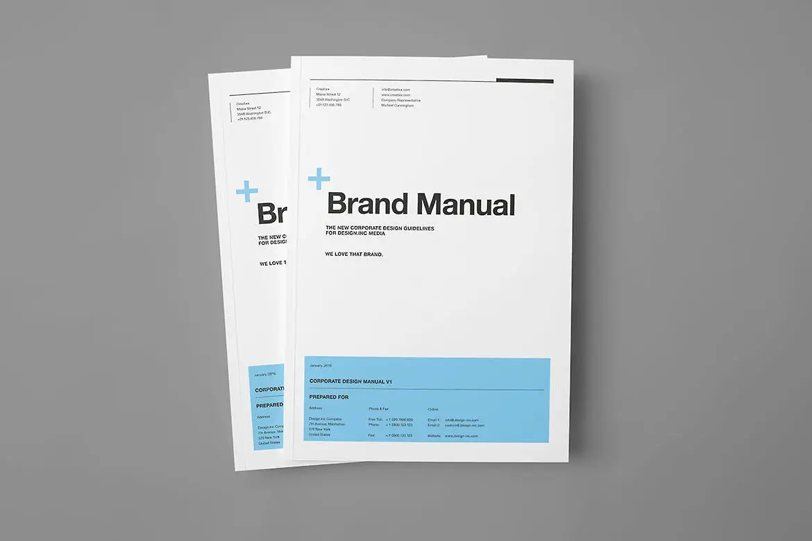
We bring you the 25+ best brand style guideline templates for branding & identity design which can be helpful to jump start your brand’s style guide.

The best monitors for working from home are a necessity for any home office. The choices on our list can make getting to work much easier!

If your job requires you to meet clients for a demonstration of a project online then you might require a best laptop for working from home.

Do you spend your day coding? Having the best tech makes your job easier. See our top picks for the best programming & coding monitors.

The best laptops for coding, programming and development in 2024, including models from Apple, Dell, Google, Huawei and more.

Using a tablet to draw is a definite learning experience. The right gear helps and our list of the Best Drawing Tablets for Beginners can give you options!

Having a high performative and powerful laptop is necessary for every music producer. Have a look at our consolidated list of best laptops for music production.

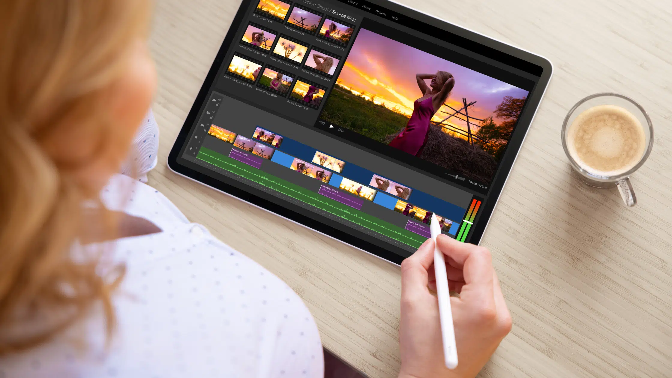
Our list of the top 10 best Mac for video editing is based on features, specifications, real-world performance, popularity, price, and user reviews.