“How much for a logo design?”
It’s one of the most frequent questions I receive from my coaching students & customers.

But trying to answer this question without specific details is a near-impossible task. How long is a piece of string?
So the next question I usually hear is, “What’s the ballpark cost to design a logo?”.
This depends, as every project is unique.
The cost of a logo design is going to be different depending on the requirements, the size of the business, if it’s a rebranding, the amount of research & strategy that’s required and so much more.
Think about it. A huge multi-national has much different needs than a small local café.
For this reason, I always get clients on a call before formally quoting.
But let’s dive into logo design pricing further…
How Much for Logo Design? – Logo Design Pricing Guide 2024
Ultimately, the cost of a professional logo design depends on who you decide to work with.
There is no average logo design cost, no set logo design price list and this goes for the USA / America, Australia, Canada, the UK, Europe, India – or anywhere for that matter!
But for the sake of answering the question, here are some logo design price ranges. Keep in mind these are just “ballpark” figures.
Budget Logo Design Price List:
- DIY / Logo makers: $0 – $50
- Logo template: $5 – $100
- Logo Contests / Crowdsourcing: $50 – $500
Mid-Range Logo Design Costs:
- Offshore Designer: $100 – $250
- Beginner Freelancer: $100 – $1000
- Experienced Freelancer: $1000 – $5,000
- Renowned Freelancer: $5000 – $15,000
- Small Design Studio: $5000 – $30,000
- Mid-Sized Agency: $5000 – $50,000+
High-End Logo Design Pricing:
- Branding Agency: $50,000 – $100,000 (generally includes strategy & global brand identity)
- Renowned Branding Agency: $100,000 – $1,000,000 + (generally includes strategy & global brand identity)
- World Famous Designer: $100,000 – $1,000,000+
These are all explained in more detail, later in the article.
Looking for a logo design? We can help.
Stand out from the crowd with a unique custom logo design that captures your brand's essence. Boost your business's identity today! View our services or schedule a call.
- Free Brand Clarity™ Call
Why is Logo Design so Valuable?
To understand the value of professional logo design you must understand three things, explained in more detail below:
This will allow you to appreciate the true value of a quality logo design.
Take note of the graphic above, showing the differences between cheap logo design VS professional logo design.
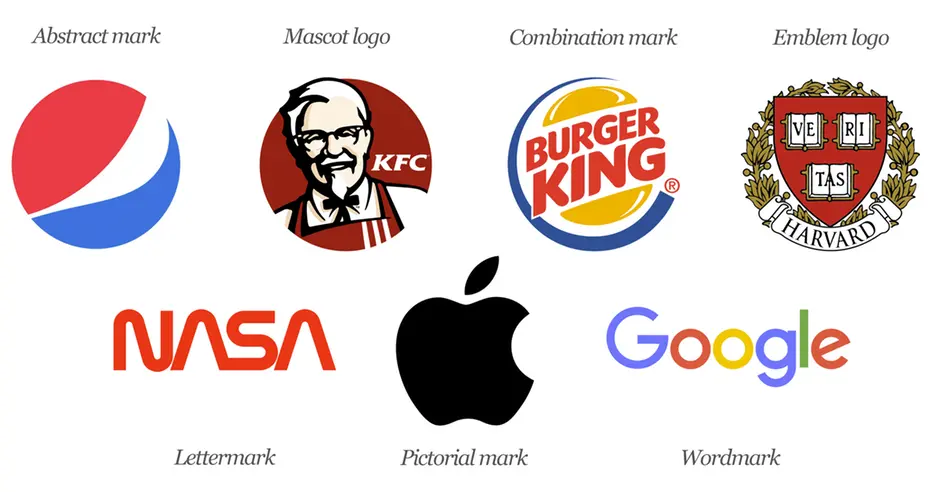
What is a Logo?

By definition, a logo is a graphic that is used to identify a company or product.
Technically speaking though, a logo is a vector graphic that can be enlarged to any size needed, without any loss of image quality, and doesn’t lose its meaning when it is shrunk down to the size of an app icon. It’s usable across a multitude of platforms and is completely unique. It stands out among competitors in similar fields.
The Benefits of Professional Logo Design
There are many benefits to having a high-quality logo for your company. When you decide that you want to go for it and start a business, you want to do everything you can, to give it a strong chance of being successful.
The right logo can be beneficial towards that goal for these reasons:
1. Recognition
Our memories tend to work in a way where we remember an image first and then a name, which explains why we can remember someone’s face but not their name. Having a strong logo that stands out is essential to making sure you stand out from your competitors. The best logos stay in the memory banks of people and can help create repeat business.
2. Consistency
A logo can provide a sense of uniformity and also make a huge impact on the reputation of your brand. A timeless and classic logo will provide your business with brand authenticity and can make your business look trustworthy, reliable, and professional even if you’ve only been in business a short time.
3. Representation
The logo for your business should be able to reveal the essence of your brand. A design that represents your business is vital to customers being able to know what you do. This is not to say that a car logo has to show a car, but the design style should be representative of the brand as a whole.
4. Beating Your Competition
If you look at almost any marketplace, the number of different brands out there can be staggering. This is why a high-quality logo can help you stand out in a crowded marketplace. With online marketing becoming more important as well as effective, a visually impressive logo that sits well on your site, social media, and marketing materials will make a huge difference in your business’ professionalism and advertising capabilities.
The Logo Design & Branding Process
When you decide that it’s time for you to have a logo designed for your business, you will have many options to choose from.
The biggest difference between the options, other than just cost, is the process that the graphic designer goes through when creating your logo. This extensive process ensures that the logo can stand the test of time, and is aligned with your business goals.
My design process looks like this:
- Design Brief: Conduct questionnaire & phone call with client to get the design brief.
- Research: Conduct research focused on the business, industry, on its history, and on its competitors.
- Sketching & Concepts: Develop the logo design concept(s) around the brief and research.
- Reflection: Take breaks throughout the design process. This lets ideas mature and to get renewed enthusiasm.
- Presentation: The logos are presented & revised as needed. These steps are repeated until completed.
- Celebrate & Launch!
Logo Design Prices / Ballpark Costs
You can put the costs of logo design into 3 buckets: budget, mid-range and high-end.
The Budget Logo ($)
These budget options are mostly for those people who may just be starting out and not have the capital they need yet to have a logo designed by a professional. If you’re serious about your business, you may want to spend some time developing a budget for your business plan so you can afford a better quality logo, because these routes may actually do more harm than good. You’ll generally get some clip art from an inexperienced designer. How much to charge for a logo design beginner?
» Read: Why professional logo design does not cost $5.00
- Free Logo Maker (Avoid!)
The cheapest logo you’ll ever use is the one you make yourself. If you have some graphic design ability, you may be able to use one of these free logo maker sites to create a suitable logo, although I highly recommend leaving designing to a professional – just like you leave your teeth for your dentist. These sites tend to limit what you can do, with generic icons and fonts.
- Cheap Freelance Services (Avoid!)
Sites such UpWork and Fiverr offer graphic design services at an approved to price point, although you’re mostly working with ‘offshore designers’ or hobbyists. You post the job, explain the parameters of what you are looking for and hope for the best. While there may be some quality designers on these sites, the designs are notorious for being plagiarized, so be careful. And realistically if you’re paying $20 for a logo, how much time are they actually investing in your project?
- Logo Contests (Avoid!)
A logo contest is where you let different designers know what you are looking for and many designers present mockups of the logo for you to choose. Only one winner is awarded a “prize”. For this reason, the quality is extremely low. These “designers” do not invest time into the project and often plagiarize to cut corners. I’ve written a huge article on the dangers of Spec Work and I would avoid design contests at all costs.
Mid-Range ($$)
This is typically where most small to mid-sized business owners should be looking for a quality logo design.
If you do the proper research, you’ll get good quality work and it won’t destroy your budget. While there are a couple of options at this price point, choosing one over the other will come down to which you’re more comfortable spending your money on.
See here for how to choose a logo designer
- Freelance Designer
Building a relationship with your designer is a great way to ensure you get what you need and there’s no better way to do this than by working directly with a freelancer. With freelance though, the amount of experience can affect the cost and quality of the work. You must vet their portfolio and testimonials before making a decision.
- Beginner Freelancer – $100 – $1000
- Experienced Freelancer – $1000 – $5,000
- Renowned Freelancer – $5000 – $15,000+
- Small Design Studio
A small design studio keeps things tight, which means you can utilize a small selection of designers at an effective price point. You generally work with a point of contact VS directly with the designers.
Prices can range from $5000 – $30,000+
Stand out from the crowd with a unique custom logo design that captures your brand's essence. Boost your business's identity today! View our services or schedule a call.
- Free Brand Clarity™ Call
- Mid-Sized Agency
A mid-sized agency generally has better quality work, but it does come with more overhead, as they need to hire managers, creative directors, and multiple designers to work on the project.
Prices can range from $5000 – $50,000+
The High-End Logo ($$$)
Logo creation that is priced in this range, generally provide their clients with much more than just a logo. They are more of an encapsulation of your brand as a whole and will provide a much more extensive process than any other option.
- Agencies
A design agency is like having a swiss-army knife. Sure, you’ll get a logo created for your business, but with an agency, they will conduct in-depth market research and competitor analysis to determine how your brand can stand out in the market and you’ll have creative teams work on your project from every angle, ensuring success at a sometimes, very high price point.
- Branding Agency $50,000 – $100,000+
- Renown Branding Agency $100,000 – $1,000,000+
Large multi-national branding projects often go into the multi-millions.
- World-Renowned Designers
Milton Glaser, Michael Bierut, Erik Spikerman, Debbie Millman. Design legends like these come with legendary price tags and are often sub contracted by larger agencies.
What if I Can’t Afford Professional Logo Design?
“If you think good design is expensive, you should see the cost of bad design.”
Design is an investment and it will pay off for many years to come. If you can’t afford a professional logo design straight away, consider these options:
- Save your money
- Apply for funding
- Invest more of your own time into the business. Define your brand vision, mission, story, and strategy – then go to your freelancer with something, rather than relying on them for all of the answers.
- Barter – Swap your product or service for branding services
- Ask your designer if they accept installments
What Logo Files Need to be Delivered?
At the end of the design project, you should be receiving:
- Logo design (colour) in vector format
- Logo design (black & white) in vector format
- Vertical logo lockup
- Horizontal logo lockup
- Square lockup (for social profile images)
- Different file formats (Ideally JPG, PNG, EPS)
- Stationery design files + any other designed files
- Style Guide (outlining fonts, colours, etc)
Tips for a Successful Logo Design
![]()
Like any industry, there are scam artists out there and they can hurt the rest of those trying to do things the right way and provide a valuable service.
This can make some wary of working with a quality freelance graphic designer, thinking that they will take the money and run, or worse, provide plagiarized work.
To avoid getting ripped off, here are some easy tips to remember:
1. Stay off Bargain Freelancer Sites
They may seem like a good option at an incredibly cheap rate and there is a reason why. A $5 logo is not going to be worth the headache and in many cases, could be a plagiarized copy.
2. Do a Reverse Image Search
This is a good way to steer clear of people stealing designs and search engines are able to see the contents of graphics and and match it from the internet. See here for a tutorial on using reverse image search.
3. Reach out to Previous Clients
Who your designer has worked with in the past can tell you a lot about their work and expertise.
4. Learn how to Choose a Logo Designer
See the tips below.
How to Choose a Logo Designer
These are 10 things you should take into account when choosing a logo designer, explained in more detail here.
- Proven success & experience
- Positive testimonials
- A thorough design process
- Awards & published work
- A strong portfolio
- Price reflective of value
- Design affiliations
- Great customer service
- Business professionalism
- Appropriate questions being asked
Beyond The Logo
With all this said, you should know that your logo is not your brand.
Your logo is just the tip of the iceberg.
Contact me to take your logo & brand to the next level!
Stand out from the crowd with a unique custom logo design that captures your brand's essence. Boost your business's identity today! View our services or schedule a call.
- Free Brand Clarity™ Call
Frequently Asked Questions
How much does a logo cost if done by a design firm?
Logo design can cost anywhere from $5000 to $20,000 but higher end firms usually charge anywhere from around $50,000 to $100,000+. The overall price usually depends on the firm's reputation.
How much does a logo cost if done by a freelancer?
If done by a freelancer, logo designs can start from anywhere around $200 (beginner) and go up to $5000+ (professional), but these beginner budget logo designs can end up being very generic and a waste of resources.
Are free logo makers any good for logo design and branding?
Generally, no. Free logo makers are made open-source, and you’ll often end up with generic icons and fonts that can allow your logo to not do your brand justice.
Are bargain freelancers any good for logo design and branding?
With bargain freelancers, you quite often end up with hobbyists or inexperienced designers that often end up plagiarizing designs. Although quite a few of these freelancers can be quite skilled, they don’t invest as much time and effort as experienced brand designers or firms
How much do experienced brand designers charge for their logos?
When it comes to logo design and branding, experienced brand designers usually charge around $3,000 and this can go up to $10,000+ depending on their overall experience.
How Much for a Logo Design in 20243?
Although it can be daunting at first, having a reference for logo design costs can help both designers and brands. For brands, it gives them realistic expectations of what to expect at various price levels. For designers, on the other hand, it gives them an idea of how to best go about pricing their services and a roadmap to what the branding and design industry is currently charging.
Designers, how much to charge for a logo design? Do you agree with the price sheets above?
Related Logo Posts:
- Best Logo Design Courses
- Logos in a Responsive Design World
- Best Free Logo Makers
- Best Software for Logo Design
- How to Present your Logo Designs to Clients
- The Logo Design Process of Top Designers [Infographic]
- Logo Design Grid Systems Deconstructed [Video Class]
📌 Want to save the blog? Pin the image below!


Love this! I have never heard of reverse search on google, very handy. Thanks Jacob, for this perspective.
Thank you so much for this.
Yes, This is true Jacob, A proper mannered logo design as per the client’s need that costs you have mentioned, I agreed.
This is such a good article! Thank you for writing this. I’m in the middle of working on doing a website for my fiancé and I’ve been noodling over what to do about a logo. This is beyond helpful. I’m pinning this so I can refer back to it!
xo Chelsea
Great – this helps. All these days I never thought of using the image search. I tried it and …. wow far better results than the normal search. And yes the reverse and related images goes much deeper. You got me buddy thanks.