Logo Package Express 3.0 – An Essential Tool for Any Logo Designer! (20-40% Discount)
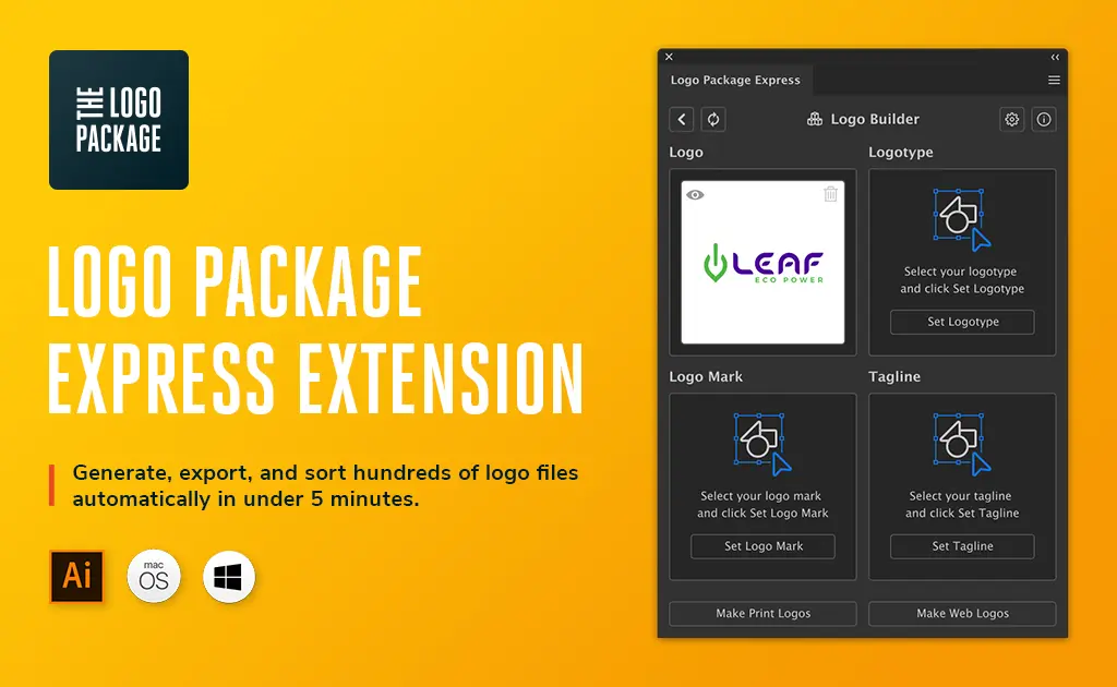
Get 20-60% off Logo Package Express with our exclusive discount coupon code. This Adobe Illustrator extension automates the exporting & sorting of logo files.
Get 20-60% off Logo Package Express with our exclusive discount coupon code. This Adobe Illustrator extension automates the exporting & sorting of logo files.
Looking for the best free logo makers online? We have compiled a list sharing the best online logo software and tools to create your next logo design.
Creating an attractive logo that attracts people’s attention can be a huge task. Our Wix Logo Maker Review will help make this hard task an easy one.
Are you looking for an easy to use logo maker to design a logo for your brand? Take a closer look at our Looka Logo Maker Review.
The best logo design books can be great for reference or inspiration and our list of the 10+ best logo design books will surely fill your bookshelf!
Looking for the best logo design resources? We’ve got the top logo design tips, articles, blogs, fonts, trends, tutorials, books, inspiration and more!
Learn logo design online! These are the top free & paid logo design courses available, sorted by value, cost and time required to complete them.
While vastly subjective, here is our list of the top 20 famous logo designers and their most iconic work. Discover the best logo designers here!
Are you looking for the best minimal logo design templates? We’ve got you covered! We all know how critical logos are to a business. After all, they set the tone … Read more
Finding it difficult to find the right font for your logo design? See our list of the best fonts for logos sorted by category & nail your design!
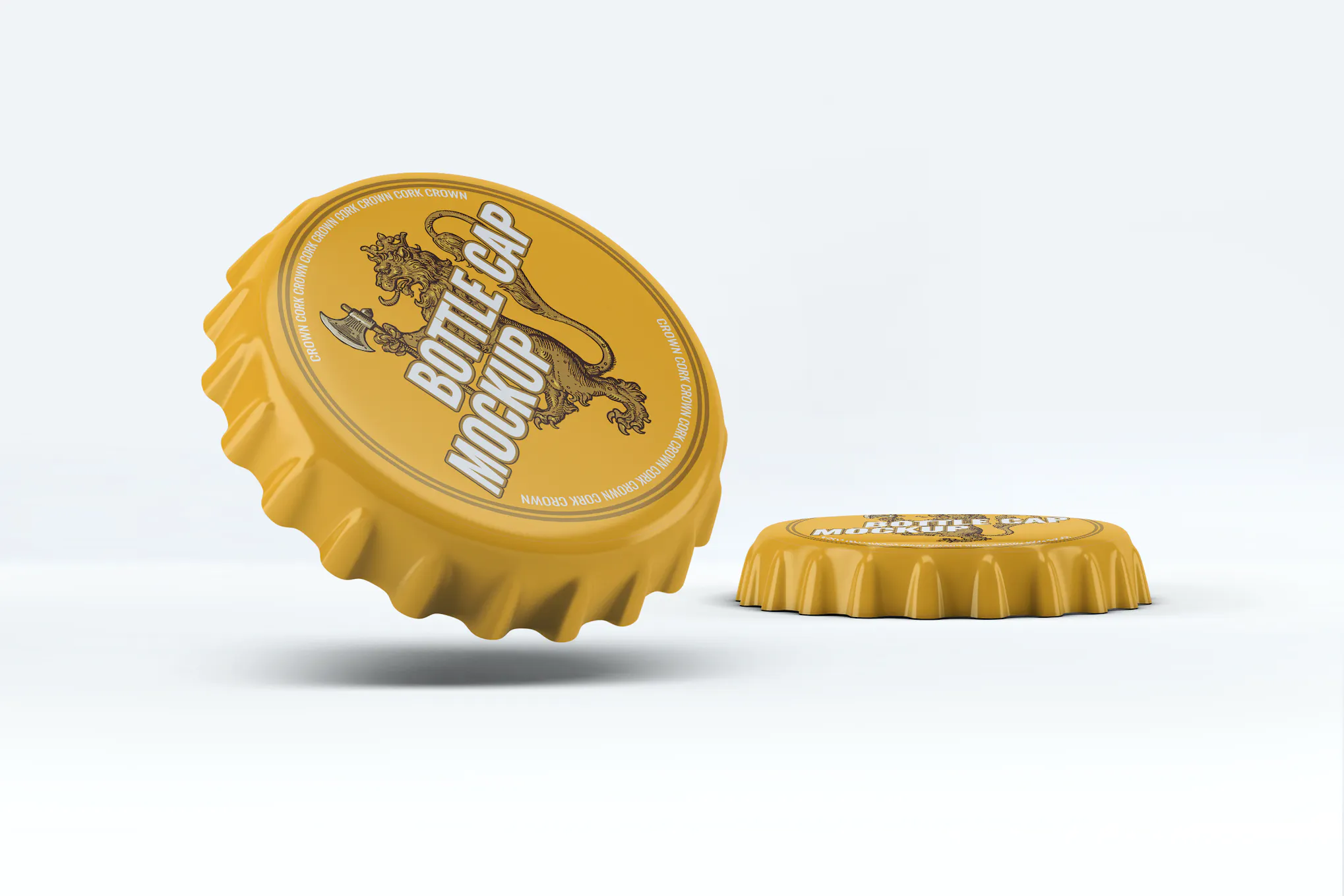
If you’re curious to find out what the best 3D logo mockups are, keep reading! We’ve compiled a list of the best logo mockups for presenting your designs.
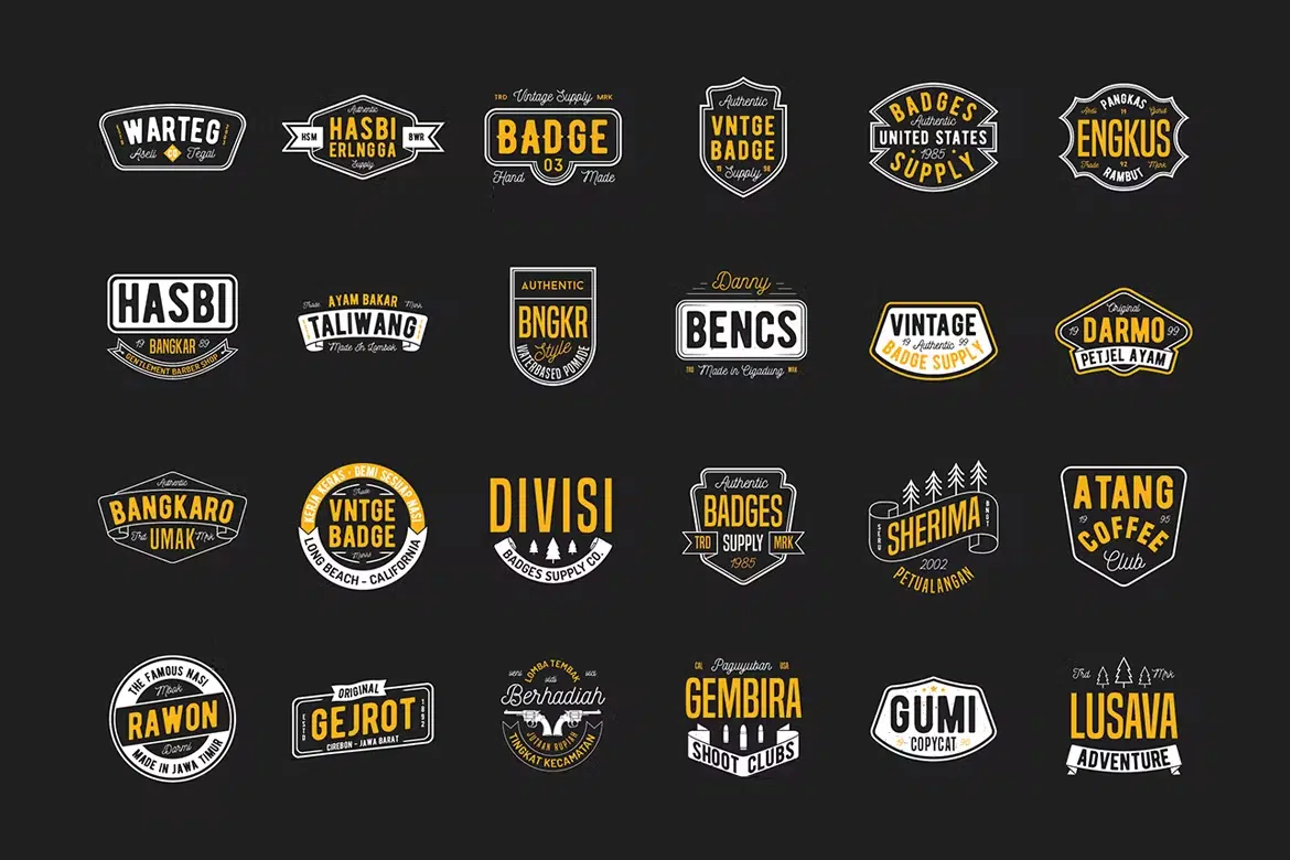
Acollection of the best vintage logo & badge templates that you can consider for travel, outdoor adventure, restaurant, sport, fitness, and branding.