Top 10 Design Conferences to Attend in 2024

Design conferences serve as hubs for design professionals to connect, exchange ideas, and gain inspiration. Here are the top 10 to attend in 2024.
Design conferences serve as hubs for design professionals to connect, exchange ideas, and gain inspiration. Here are the top 10 to attend in 2024.
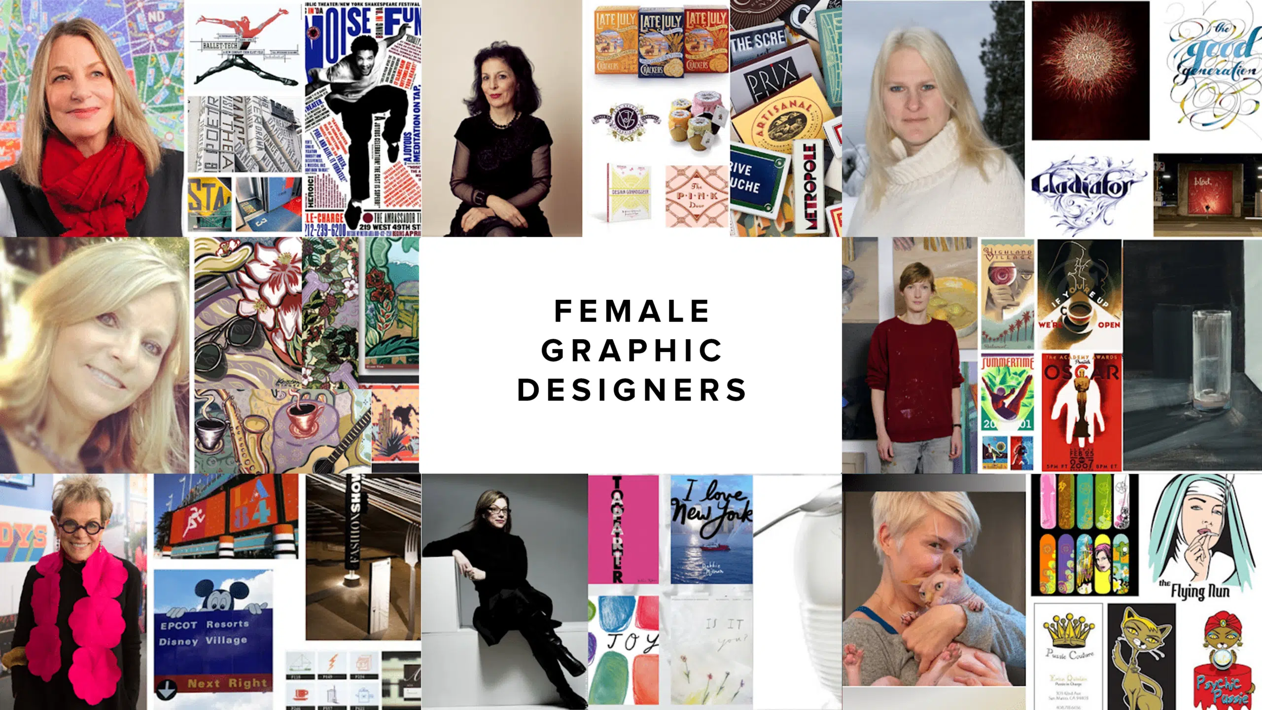
In this blog we will introduce you to 8 of the best female graphic designers while showing off their best work!
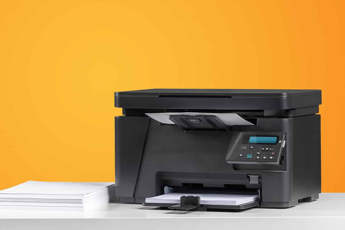
What is the best printer for a graphic designer? Here we we review the top best most effective printers on the market for graphic design in 2024.
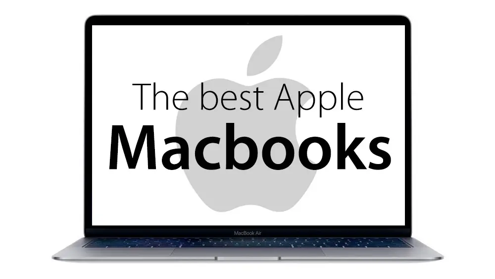
Looking for Apple’s best MacBook & their affordable deals? We list the best Apple MacBooks for graphic design. Have a look to invest in the right one.

We’ve selected the best iPads for graphic design based on their features, functionality, and overall value. Find the best iPad for graphic design here!

Looking for the best smart phones available today? We’ve ranked the top mobile smartphones for graphic designers including the best Apple & Android phones.
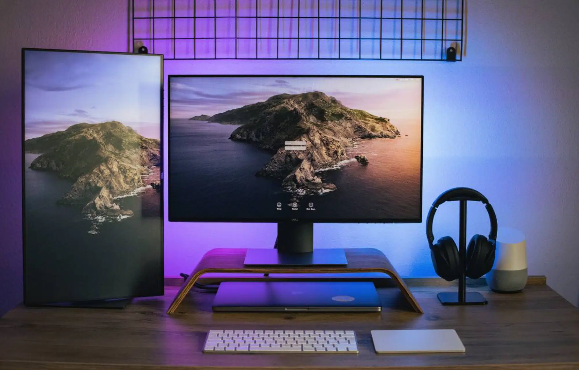
The best gear can benefit your career but when you’re on a budget, it can be expensive. See the best budget monitors for graphic design to save time & money.

Business cards must be appealing and enable you to maximize the benefits of your enterprise. Check out our list of the best business card design software.
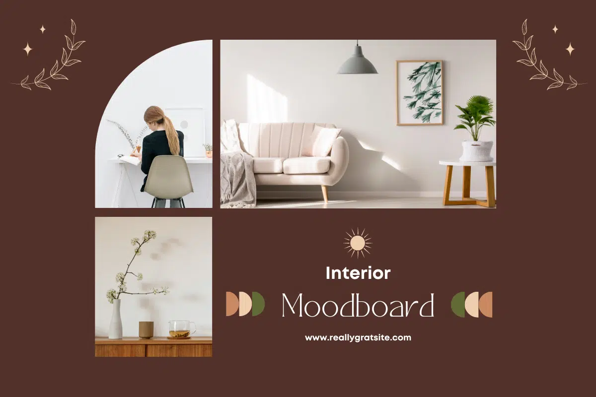
A mood board creator helps you to showcase your ideas and vision toward a subject matter. It helps to visuallly represent text messages or sample objects.

Looking for 2024 graphic design trends? If you are keen to stay up to date, you have landed at the right place. See graphic design trends for 2024!

Surfing for Adobe InDesign alternatives? You have landed in the right place.
We look at the best free Adobe InDesign alternatives as well as paid options.
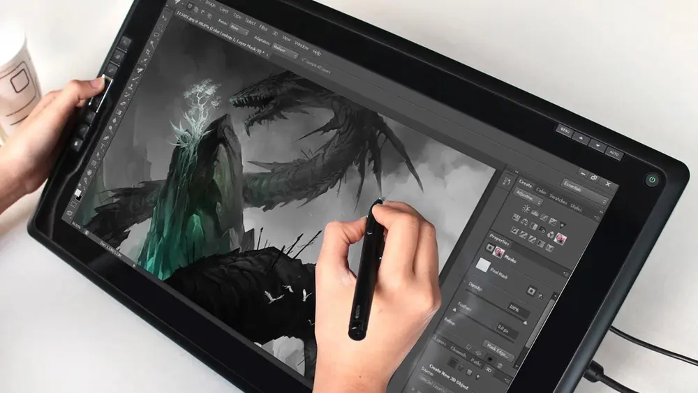
Are you in the market for a drawing tablet? Huion tablets can be some of the best value out there, take a look at the best Huion tablets for graphic designers.