2024 Typography Trends

Join us as we explore the latest typography trends for 2024, empowering you to stay ahead of the curve and elevate your design game.
Join us as we explore the latest typography trends for 2024, empowering you to stay ahead of the curve and elevate your design game.
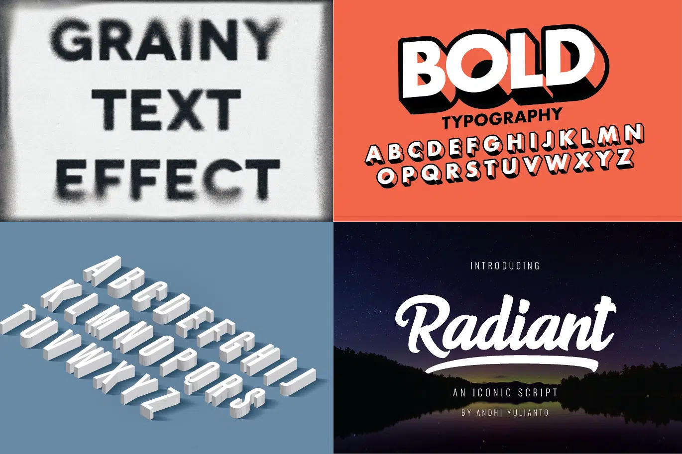
Try out these diverse Typography Techniques, tailored for users ranging from beginners to those with intermediate and advanced skills!
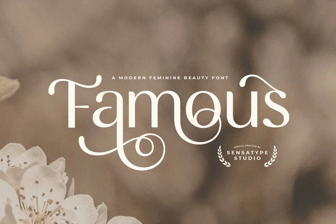
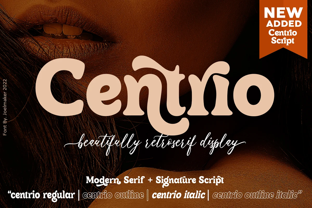
The best beauty and cosmetics fonts are perfect for any project that needs a touch of glam to make it sparkle and our list can help you do just that.
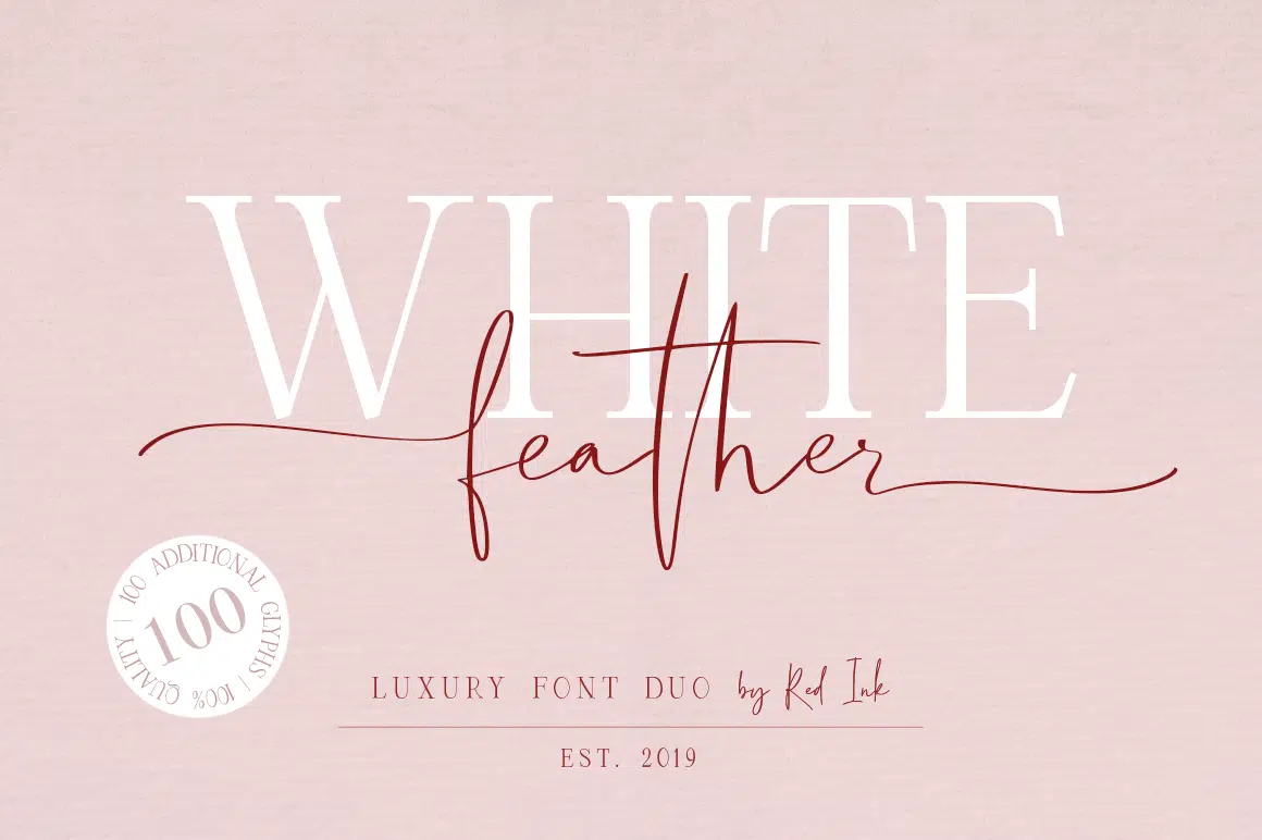
Fashion is more than runways and dresses. Our list of the best fashion fonts can open a door that your projects never knew existed.
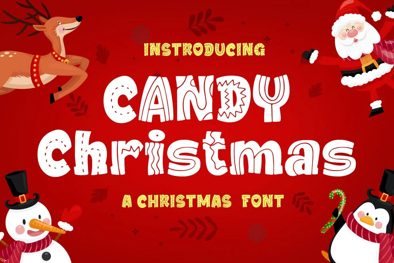
Before we know it, the Christmas season will be here. Use our Top 25 Christmas Fonts for Festive Graphic Design to add some holiday cheer to your designs!
A list of the best free & premium hi-tech, futuristic, techno and sci-fi fonts perfect for branding, logos, books, games, magazines, posters and more.
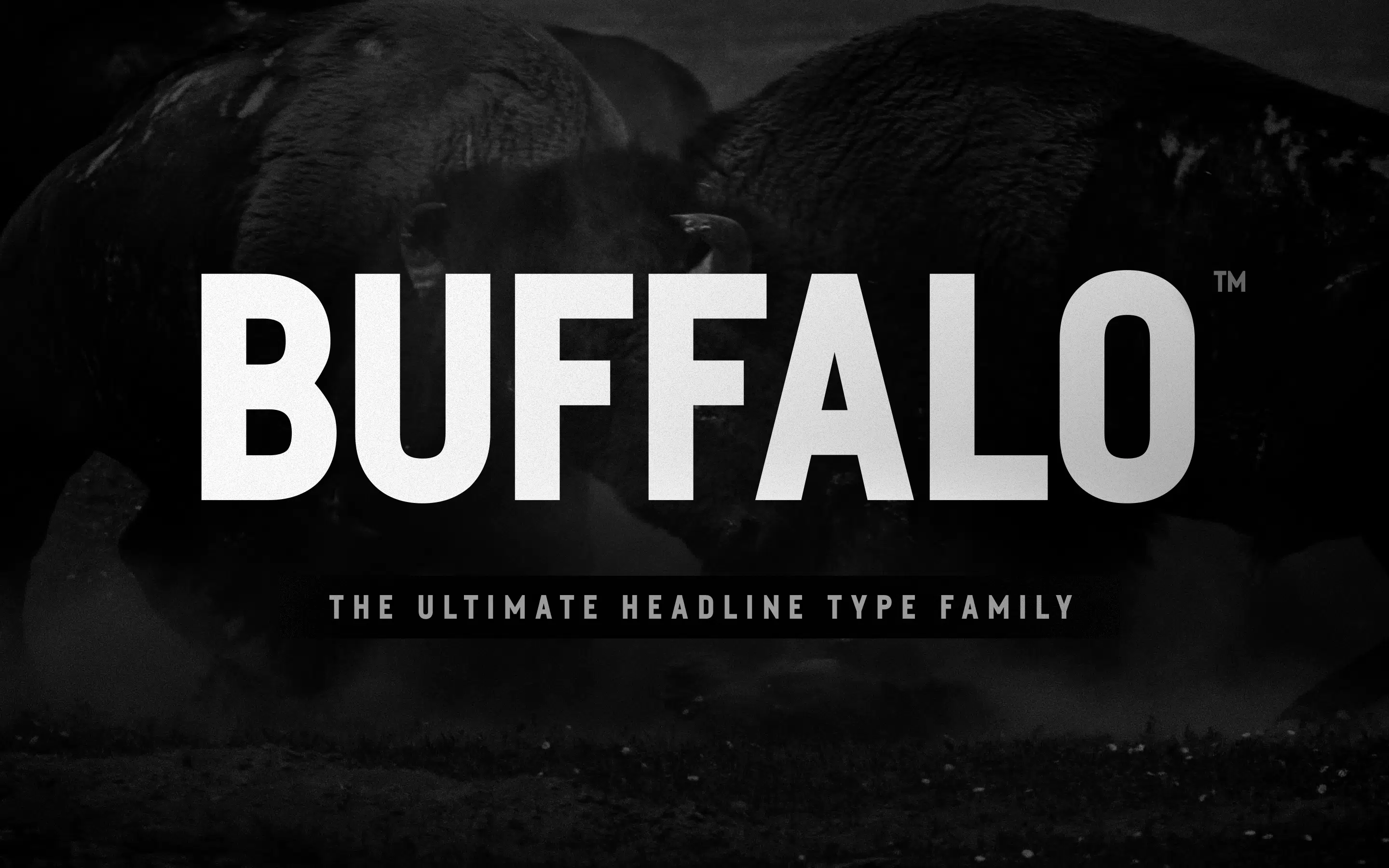
Attract customers and readers with our list of the 25 Best Headline Fonts. These are perfect for headers, titles and drawing attention.
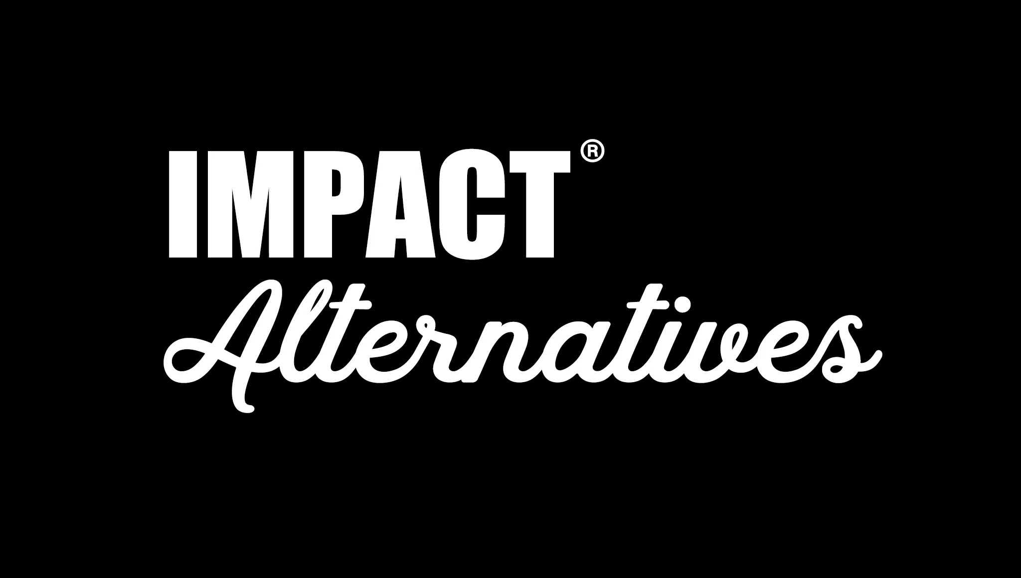
Looking for fonts similar to Impact? Check out our top choices for Impact font alternatives and get those impactful headlines to work.
Having cool fonts to draw, when you’re working on hand lettering and calligraphy projects, can be a blast. Our list of more than 30 options can make them shine
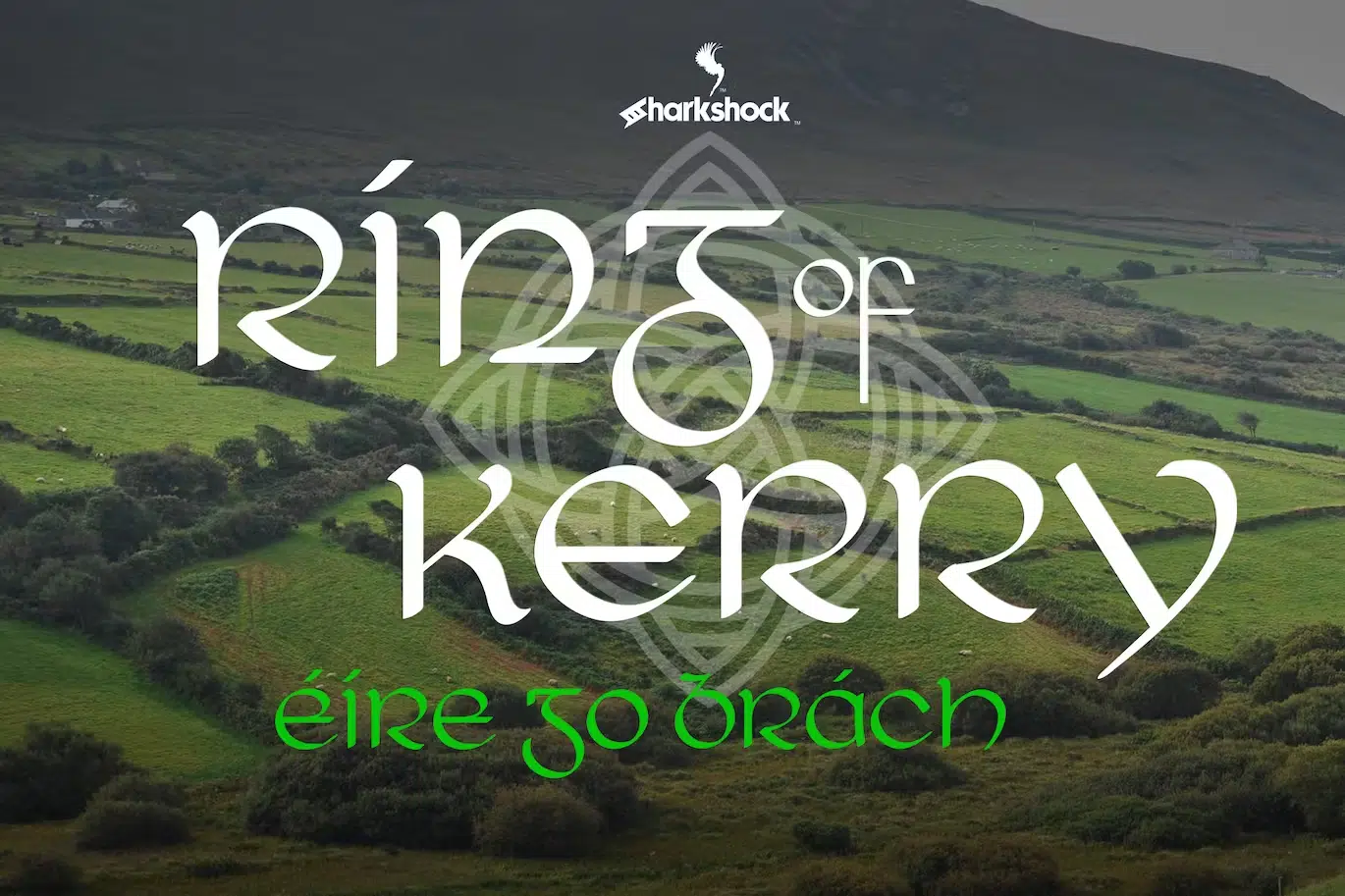
Looking for the best Irish fonts for your cultural or celtic-themed designs? Look no further than this post on the best Celtic fonts for an Irish flair!
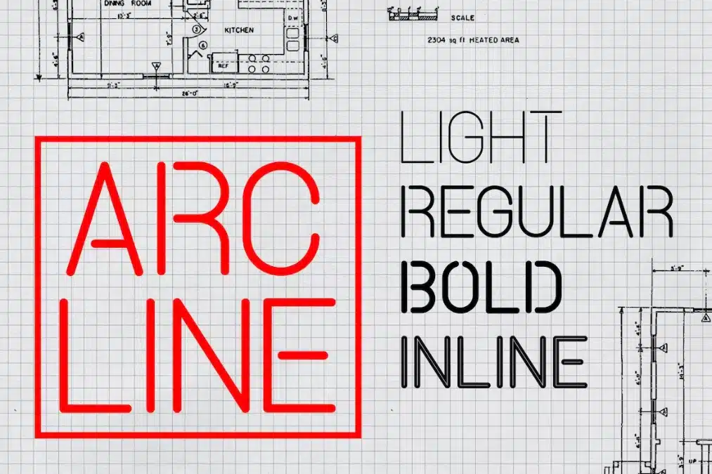
Discover the best engineering fonts for your projects. From futuristic designs to precise and refined styles, these fonts capture the essence of engineering.

Explore the captivating world of Taylor Swift fonts, enhancing the visual impact of her music. Discover how typography elevates her musical artistry.